Libraries and dataset
We’ll use the tmap package along with
sf for some spatial data manipulation. We’ll continue
using the World dataset, but we’ll also create some point
data.
library(tmap)
library(sf)

data("World")

# Create some point data
set.seed(123)
cities <- st_as_sf(data.frame(
  name = c("New York", "London", "Tokyo", "Sydney", "Rio de Janeiro"),
  lon = c(-74.006, -0.1276, 139.6503, 151.2093, -43.1729),
  lat = c(40.7128, 51.5074, 35.6762, -33.8688, -22.9068),
  pop = round(runif(5, 5e6, 20e6))
), coords = c("lon", "lat"), crs = 4326)
Faceting with tmap
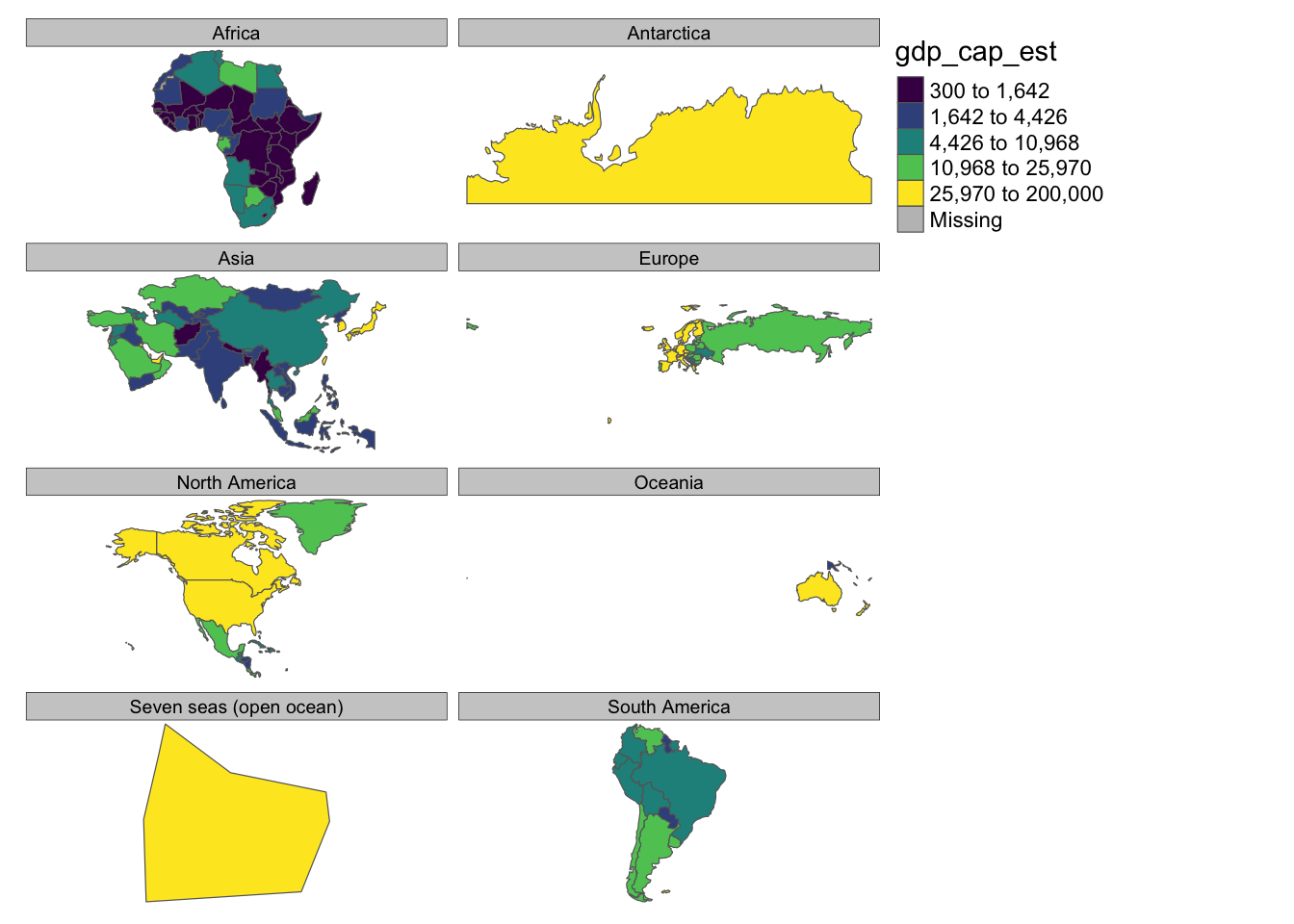
Faceting allows us to create small multiples based on a categorical variable.
This creates a separate map for each continent, allowing easy comparison of GDP per capita across different regions.
tm_shape(World) +
  tm_polygons("gdp_cap_est", style = "quantile", palette = "viridis") +
  tm_facets(by = "continent") +
  tm_layout(frame = FALSE)
Combining Different Geometries
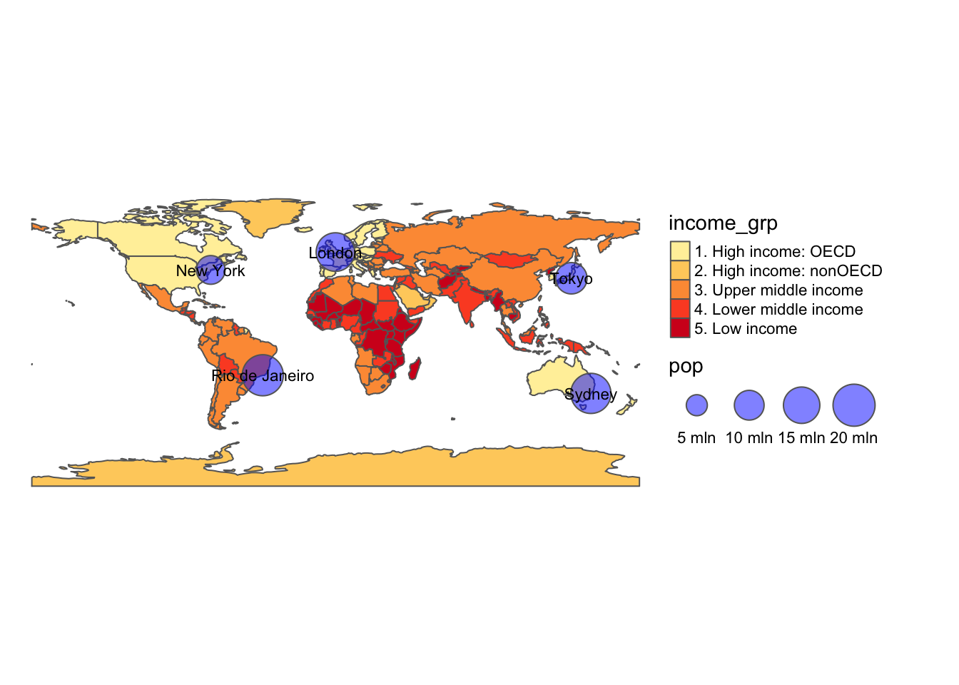
We can combine different types of geometries in a single map.
This map shows countries colored by income group and cities represented by bubbles sized according to population.
tm_shape(World) +
  tm_polygons("income_grp", palette = "YlOrRd") +
  tm_shape(cities) +
  tm_bubbles(size = "pop", col = "blue", alpha = 0.5, scale = 2) +
  tm_text("name", size = 0.7) +
  tm_layout(legend.outside = TRUE, frame = FALSE)
Custom Projections
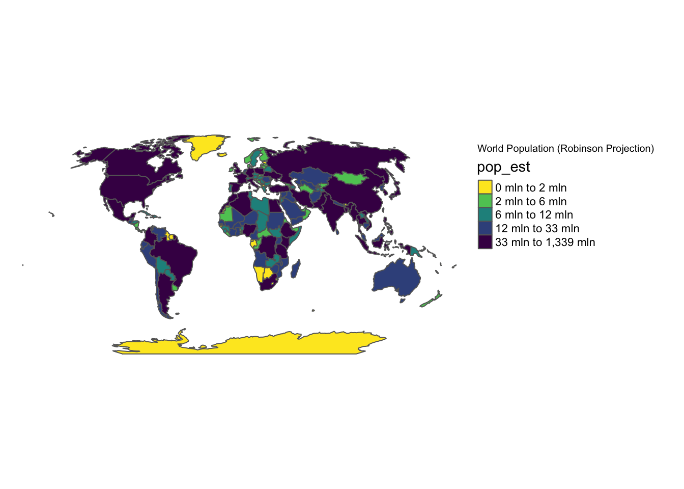
tmap allows us to easily change map projections.
The projection argument in tm_shape() allows
us to specify any projection supported by the PROJ
library. Let’s create a map using the
Robinson projection:
tm_shape(World, projection = "+proj=robin") +
  tm_polygons("pop_est", style = "quantile", palette = "-viridis") +
  tm_layout(
    legend.outside = TRUE,
    title = "World Population (Robinson Projection)",
    frame = FALSE
  )
Advanced Layout Customization
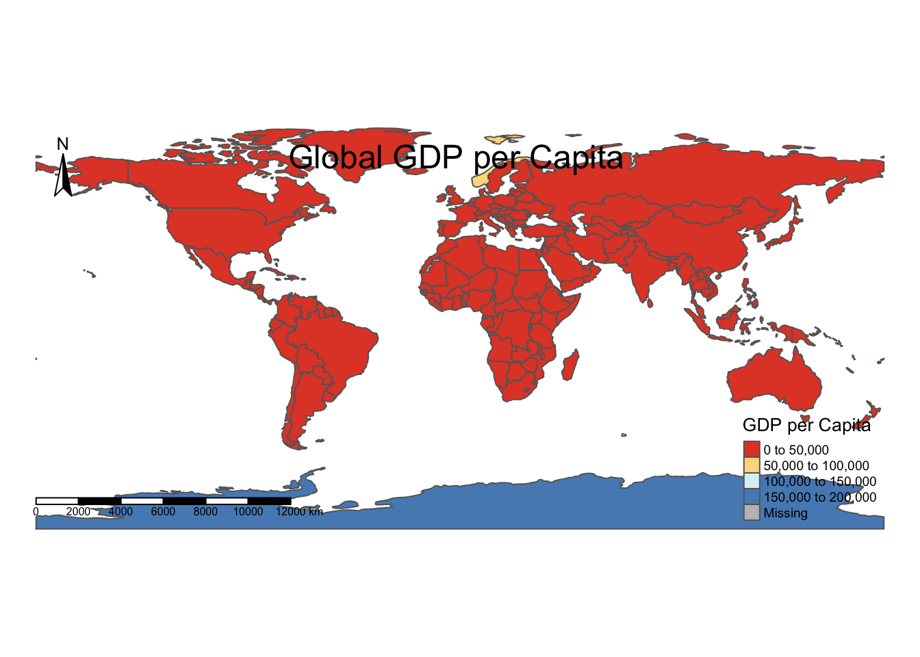
We can extensively customize the layout of our maps.
This example demonstrates how to customize the title, legend, and add elements like a compass and scale bar.
tm_shape(World) +
  tm_polygons("gdp_cap_est", palette = "RdYlBu", style = "pretty", title = "GDP per Capita") +
  tm_layout(
    title = "Global GDP per Capita",
    title.position = c("center", "top"),
    title.size = 1.5,
    legend.title.size = 1,
    legend.text.size = 0.6,
    legend.position = c("right", "bottom"),
    frame = FALSE
  ) +
  tm_compass(position = c("left", "top")) +
  tm_scale_bar(position = c("left", "bottom"))
Going further
You might be interested in
