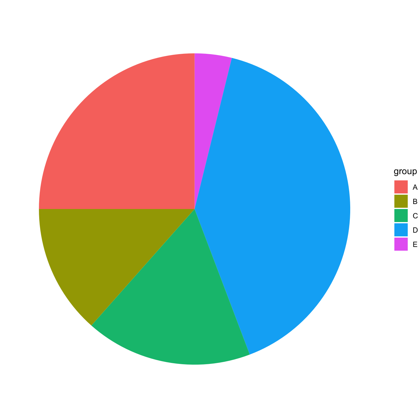
Most basic pie chart
ggplot2 does not offer any specific geom to build
piecharts. The trick is the following:
- input data frame has 2 columns: the group names (
grouphere) and its value (valuehere) - build a stacked barchart with one bar only using the
geom_bar()function. - Make it circular with
coord_polar()
The result is far from optimal yet, keep reading for improvements.
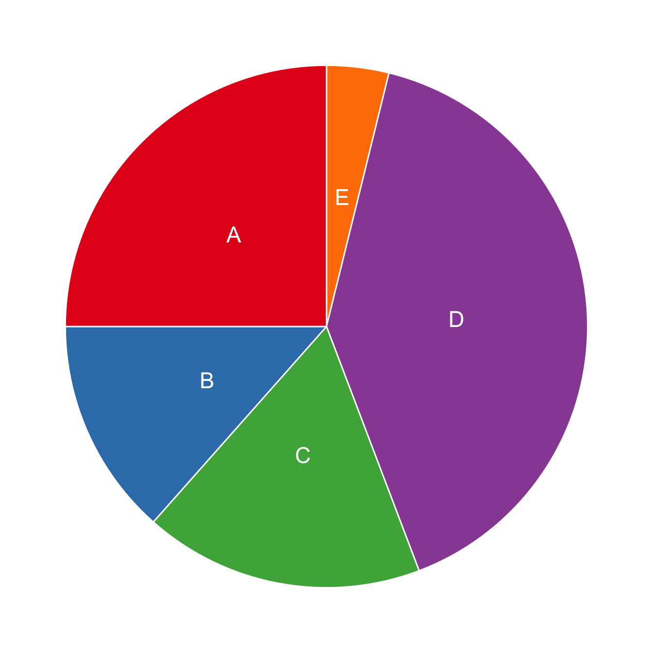
Improve appearance
Previous version looks pretty bad. We need to:
- remove useless numeric labels
- remove grid and grey background
It’s better now, just need to add labels directly on chart.

# Load ggplot2
library(ggplot2)

# Create Data
data <- data.frame(
  group=LETTERS[1:5],
  value=c(13,7,9,21,2)
)

# Basic piechart
ggplot(data, aes(x="", y=value, fill=group)) +
  geom_bar(stat="identity", width=1, color="white") +
  coord_polar("y", start=0) +

  theme_void() # remove background, grid, numeric labels
Adding labels with geom_text()
Since ggplot2 v2.2.0, the position of labels can easily be set with
position_stack().
# Load ggplot2
library(ggplot2)

# Create Data
data <- data.frame(
  group=LETTERS[1:5],
  value=c(13,7,9,21,2)
)

# Basic piechart
ggplot(data, aes(x="", y=value, fill=group)) +
  geom_bar(stat="identity", width=1, color="white") +
  coord_polar("y", start=0) +

  theme_void() + # remove background, grid, numeric labels

  geom_text(aes(label = group), position = position_stack(vjust = 0.5)) +
  scale_fill_brewer(palette="Set1")