About
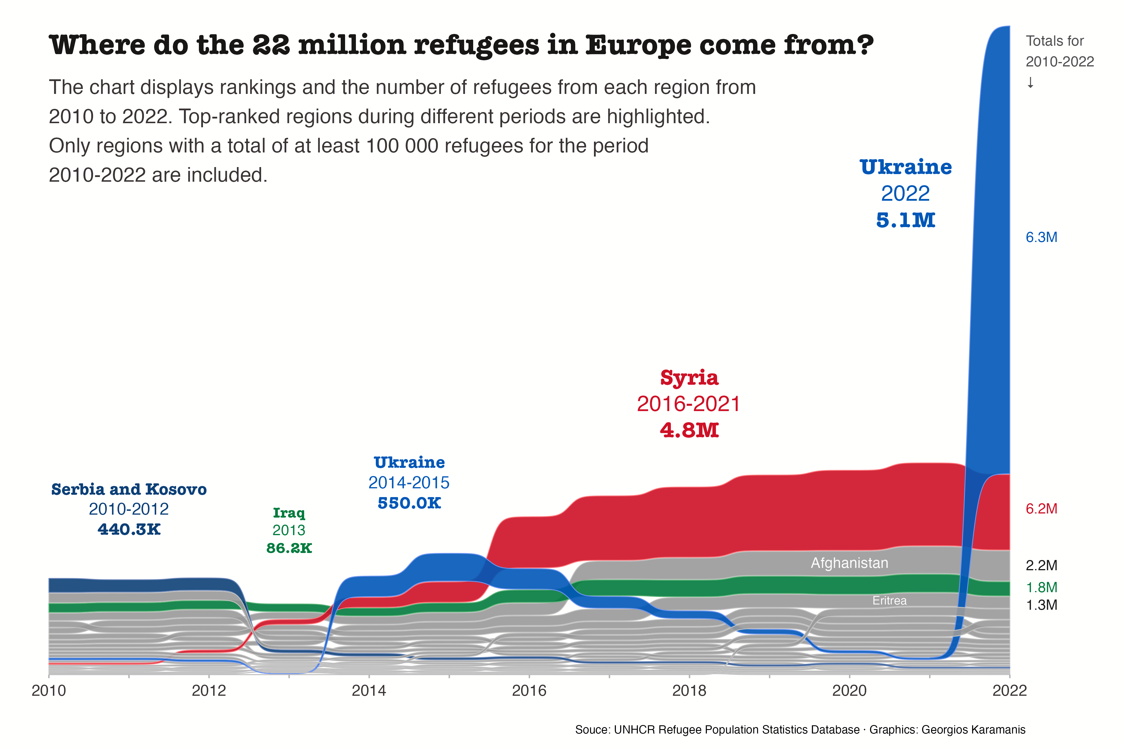
This chart visualizes refugee flows into European countries between 2010-2022 using a Sankey bump chart. It highlights the major countries of origin (including Syria, Ukraine, and Afghanistan) and shows how displacement patterns have evolved over this period.
The visualization is based on UNHCR refugee data and focuses on the main refugee movements into Europe, providing insights into the changing dynamics of forced displacement and humanitarian crises.
It has been created by Georgios Karamanis. Thanks to him for sharing this insightful chart!
Load required libraries
This visualization requires several R packages, including:
tidyverse for data manipulation and visualization,
ggsankey for creating the Sankey bump chart,
ggh4x for extended ggplot2 features, and
sf for handling spatial data.
Load and prepare the data
This section imports refugee population data from the TidyTuesday GitHub repository and retrieves European geographical boundaries from the naturalearth dataset, which we’ll use to identify refugee-hosting countries in Europe.
# Read the refugee population data from GitHub
population <- readr::read_csv('https://raw.githubusercontent.com/rfordatascience/tidytuesday/master/data/2023/2023-08-22/population.csv')

# Get European countries from the naturalearth dataset
eu <- rnaturalearthdata::countries110 %>%
  st_as_sf() %>%
  filter(continent == "Europe")
Process refugee data for European countries
This code cleans and aggregates the refugee data by standardizing country names (particularly for Syria and Serbia/Kosovo), filtering for refugees hosted in European countries, and calculating yearly totals for each country of origin. It also identifies the top refugee-sending country for each year.
ref_eu_year <- population %>%
  # Clean up country names
  mutate(
    coo_name = case_when(
      str_detect(coo_name, "Syria") ~ "Syria",
      str_detect(coo_name, "Serbia") ~ "Serbia and Kosovo",
      TRUE ~ coo_name
    )
  ) %>%
  # Filter for European countries and calculate yearly totals
  filter(coa_iso %in% eu$sov_a3) %>%
  group_by(year, coo_name) %>%
  summarise(
    total = sum(refugees)
  ) %>%
  ungroup() %>%
  group_by(year) %>%
  mutate(top_year = total == max(total)) %>%
  ungroup()
Identify regions with significant refugee populations
This code identifies the primary countries of origin by summing total refugee counts across all years and filtering for countries that have sent at least 100,000 refugees to European countries during the study period.
Create annotation data
This code creates a data frame for chart annotations that will highlight major refugee movements to Europe. The code:
- Identifies five key refugee events from Serbia/Kosovo, Iraq, Syria, and Ukraine
- Sets x and y coordinates for positioning each annotation on the plot
- Defines time periods for each event (single year or year ranges)
- Calculates total refugee numbers for each specified period
-
Formats annotation labels to include:
- Country name in bold
- Time period (single year or range)
- Total refugee count with appropriate scaling
annot <- tribble(
  ~country, ~x, ~y, ~yr1, ~yr2,
  "Serbia and Kosovo", 2011, 1.5e6, 2010, 2012,
  "Iraq", 2013, 1.3e6, 2013, 2013,
  "Ukraine", 2014.5, 1.8e6, 2014, 2015,
  "Syria", 2018, 2.6e6, 2016, 2021,
  "Ukraine", 2020.7, 5e6, 2022, 2022
) %>%
  rowwise() %>%
  mutate(
    tot = sum(subset(ref_eu_year, coo_name == country & between(year, yr1, yr2))[, "total"]),
    label = paste0("**", country, "**",
                  if_else(yr1 != yr2,
                         paste0("<br>", yr1, "-", yr2),
                         paste0("<br>", yr2)),
                  "<br>", "**",
                  scales::number(tot, accuracy = 0.1,
                               scale_cut = scales::cut_short_scale()),
                  "**")
  ) %>%
  ungroup()
Set up fonts
This code sets up the font choices for the visualization:
- f1: “Outfit” - used for primary text elements
- f2: “Newsreader Display” - used for display or header text
Create the visualization
The code creates a professional refugee flow visualization with these key components:
Data Preparation and Base Plot
- Filters data to include only top refugee-sending countries
- Initializes a ggplot object with this filtered data
Visualization Layers
1. Main Flow Layer
-
Uses
geom_sankey_bumpto create a Sankey Bump Diagram - Highlights specific countries from annotation data
- Sets flow transparency (alpha = 0.9) and spacing (space = 1e4)
2. Annotation Layers
-
Adds rich text labels for key events using
geom_richtext - Places totals for 2010-2022 with an arrow indicator
- Adds top 5 country totals with specific positioning
- Labels Afghanistan and Eritrea in white text
3. Title Elements
- Main title in Newsreader Display font
- Descriptive subtitle with wrapped text
- Source citation at bottom
4. Styling and Scales
- Custom color scheme: Ukraine - #0057B7 (blue); Syria - #CE1126 (red); Iraq/others - Custom colors
- X-axis showing 2010-2022 in 2-year intervals
- Size scale for text (4-6 range)
5. Theme Customization
- Minimal theme base with
theme_minimal - White background (#FFFFFE)
- Removed grid lines and y-axis
- Custom margins and text styling
- Hidden legend
p <- ref_eu_year %>%
  # Keep only top countries
  filter(coo_name %in% ref_top$coo_name) %>%
  ggplot() +
  # Alluvial, highlight some top countries
  geom_sankey_bump(aes(x = year, node = coo_name, fill = if_else(coo_name %in% annot$country, coo_name, NA), value = total, color = after_scale(colorspace::lighten(fill, 0.4))), linewidth = 0.3, type = "alluvial", space = 1e4, alpha = 0.9) +
  # Labels for top countries by year(s)
  ggtext::geom_richtext(data = annot, aes(x = x, y = y, label = label, color = country, size = tot), vjust = 0, family = f1, fill = NA, label.color = NA) +
  # Sums of the top 5 countries for 2010-2022
  annotate("text", x = 2022.2, y = 7.3e6, label = "Totals for\n2010-2022\n↓", family = f1, hjust = 0, vjust = 1, color = "grey30") +
  geom_text(data = ref_top %>% filter(row_number() <= 5), aes(x = 2022.2, y = c(5e6, 1.9e6, 1.25e6, 1e6, 0.8e6), label = scales::number(total, accuracy = 0.1, scale_cut = scales::cut_short_scale())), family = f1, hjust = 0, color = c("#0057B7", "#CE1126", "grey10", "#017b3d", "grey10")) +
  # Labels for two countries
  annotate("text", x = c(2020, 2020.5), y = c(1.28e6, 0.85e6), label = c("Afghanistan", "Eritrea"), color = "grey99", family = f1, size = c(4, 3.2)) +
  # Title and subtitle
  annotate("text", x = 2010, y = 7.2e6, label = "Where do the 22 million refugees in Europe come from?", size = 8, family = f2, fontface = "bold", hjust = 0, color = "#181716") +
  annotate("text", x = 2010, y = 6.8e6, label = str_wrap("The chart displays rankings and the number of refugees from each region from 2010 to 2022. Top-ranked regions during different periods are highlighted. Only regions with a total of at least 100 000 refugees for the period 2010-2022 are included.", 78), size = 5.5, family = f1, hjust = 0, vjust = 1, color = "#393433") +
  # Scales, coord, theme
  scale_x_continuous(breaks = seq(2010, 2022, 2), guide = "axis_minor") +
  scale_fill_manual(values = c("#017b3d", "#0C4077", "#CE1126", "#0057B7"), na.value = "grey60") +
  scale_color_manual(values = c("#017b3d", "#0C4077", "#CE1126", "#0057B7"), na.value = "grey60") +
  scale_size_continuous(range = c(4, 6)) +
  coord_cartesian(clip = "off", expand = FALSE) +
  labs(
    caption = "Souce: UNHCR Refugee Population Statistics Database · Graphics: Georgios Karamanis"
  ) +
  theme_minimal(base_family = f1) +
  theme(
    legend.position = "none",
    plot.background = element_rect(fill = "#FFFFFE", color = NA),
    axis.title = element_blank(),
    axis.text.y = element_blank(),
    axis.text.x = element_text(size = 12, margin = margin(5, 0, 0, 0), family = f1, color = "#393433"),
    panel.grid = element_blank(),
    axis.ticks.x = element_line(color = "grey70"),
    ggh4x.axis.ticks.length.minor = rel(1),
    plot.margin = margin(20, 75, 10, 35),
    plot.caption = element_text(margin = margin(20, 0, 0, 0))
  )

#ggsave(here::here("web-sankey-refugees","refugee_flows_viz.png"), p, width = 12, height = 8, dpi = 320, bg = "#FFFFFE", create.dir = TRUE)

knitr::include_graphics("https://raw.githubusercontent.com/holtzy/R-graph-gallery/master/web-sankey-refugees/refugee_flows_viz.png")
Going further
You might be interested in:
- Learning more about Sankey diagrams
- How to create an interactive sankey diagram
- Apply a theme to your charts