Start by creating a dataset and a graph object using the
igraph package.
# Libraries
library(ggraph)
library(igraph)
library(tidyverse)
theme_set(theme_void())

# data: edge list
d1 <- data.frame(from="origin", to=paste("group", seq(1,7), sep=""))
d2 <- data.frame(from=rep(d1$to, each=7), to=paste("subgroup", seq(1,49), sep="_"))
edges <- rbind(d1, d2)

# We can add a second data frame with information for each node!
name <- unique(c(as.character(edges$from), as.character(edges$to)))
vertices <- data.frame(
  name=name,
  group=c( rep(NA,8) ,  rep( paste("group", seq(1,7), sep=""), each=7)),
  cluster=sample(letters[1:4], length(name), replace=T),
  value=sample(seq(10,30), length(name), replace=T)
)

# Create a graph object
mygraph <- graph_from_data_frame( edges, vertices=vertices)
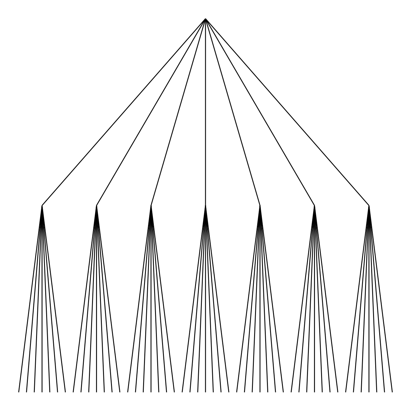
Circular or linear layout
First of all, you can use a linear or a circular representation using
the circular option thanks to the layout argument of
ggraph.
Note: a customized version of the circular dendrogram is available here, with more node features and labels.
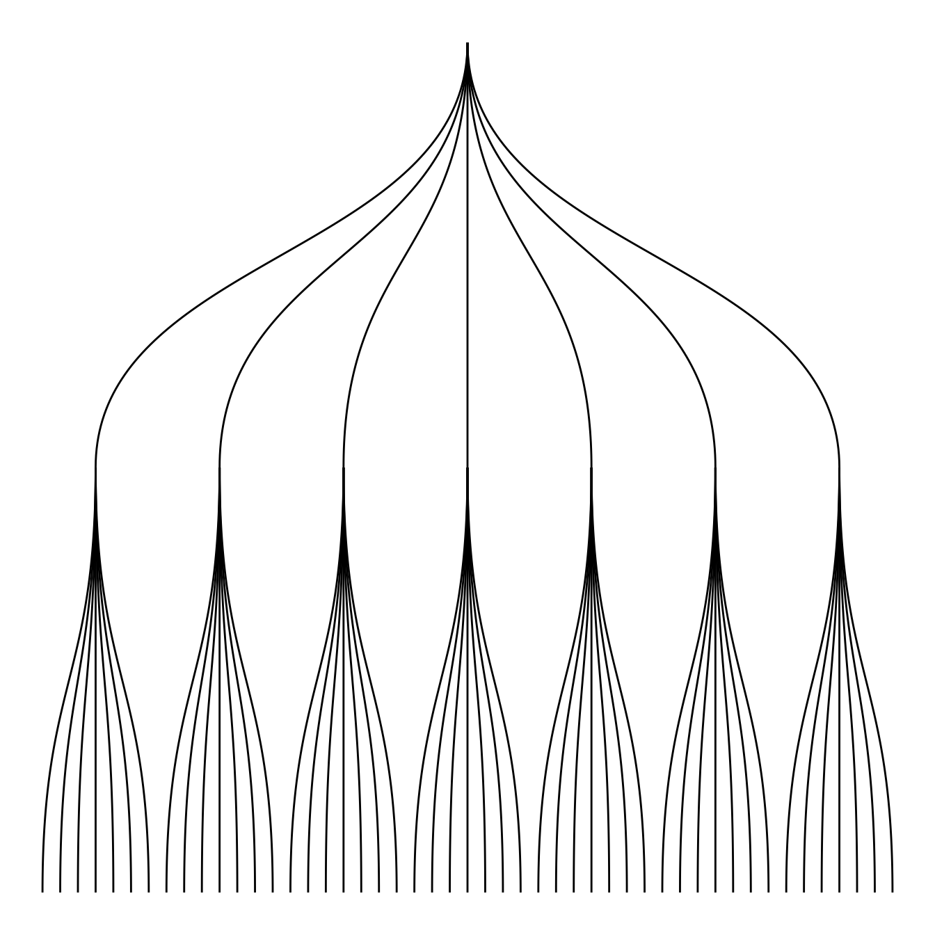
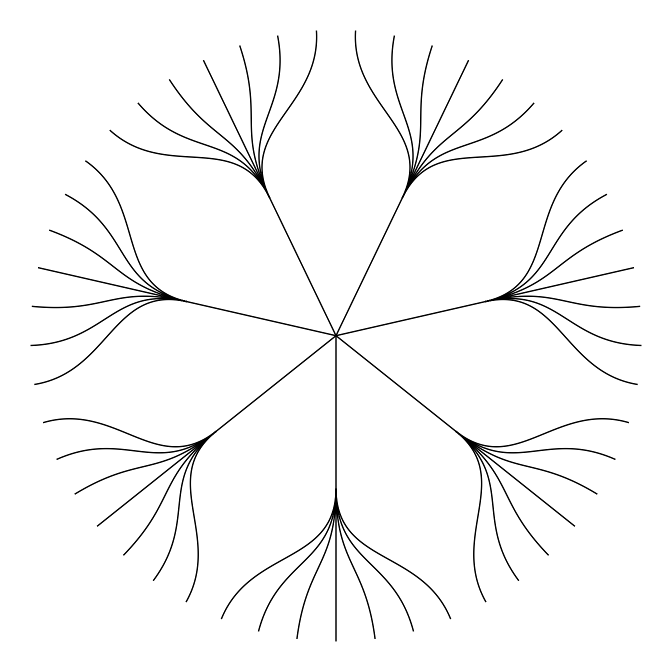
Edge style
Then you can choose between different styles for your edges. The
ggraph package comes with 2 main functions:
geom_edge_link and geom_edge_diagonal.
Note that the most usual “elbow” representation is not implemented for hierarchical data yet.

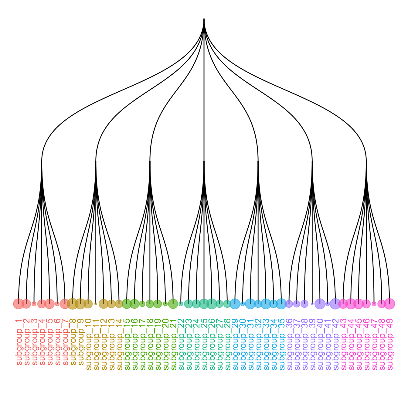
Labels and Nodes
You probably want to add labels to give more insight to your tree. And
eventually nodes. This can be done using
the geom_node_text and
geom_node_point respectively.
Note: the label addition is a bit more tricky for circular dendrogram, a solution is suggested in graph #339.
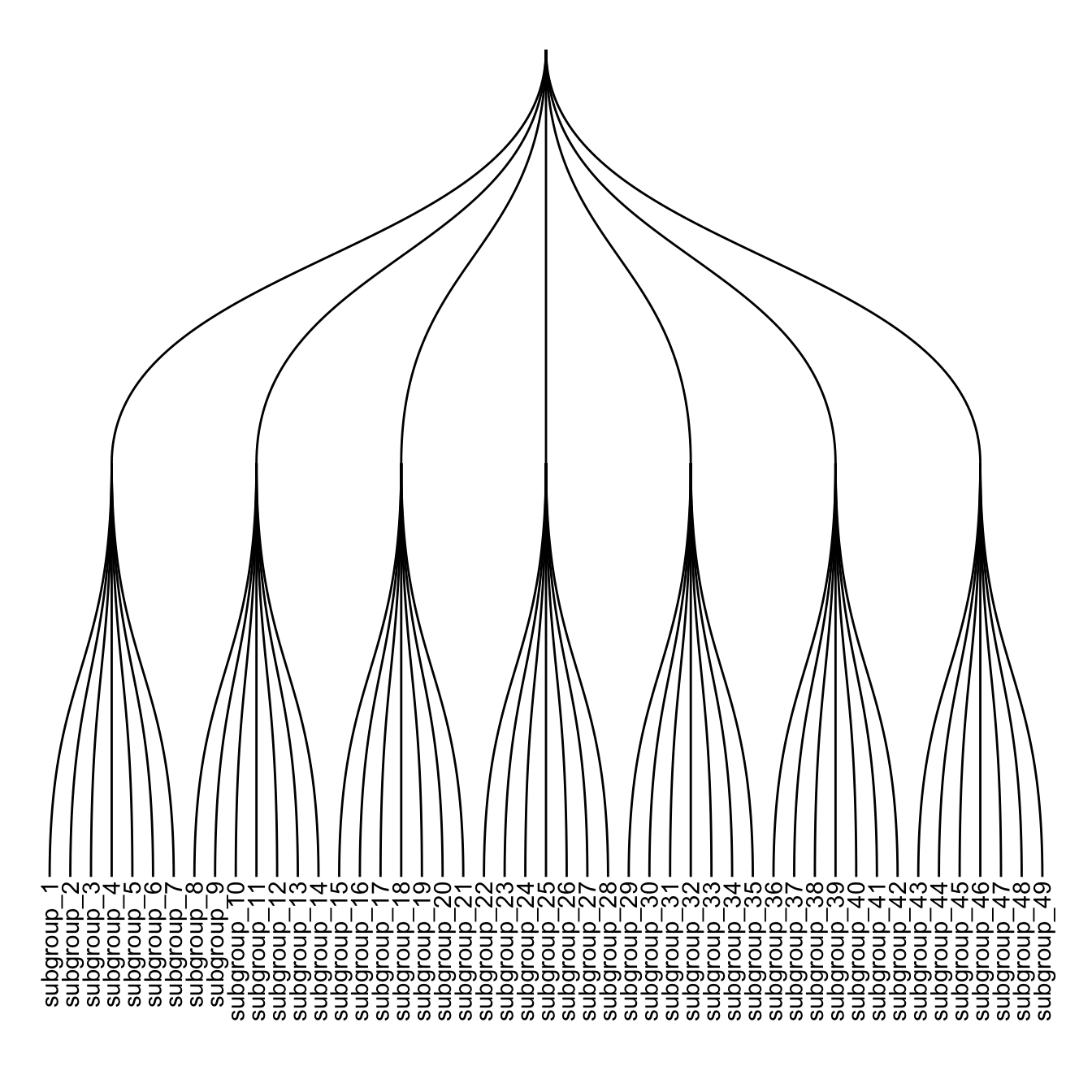
# Left
ggraph(mygraph, layout = 'dendrogram') +
  geom_edge_diagonal() +
  geom_node_text(aes( label=name, filter=leaf) , angle=90 , hjust=1, nudge_y = -0.01) +
  ylim(-.4, NA)
# Right
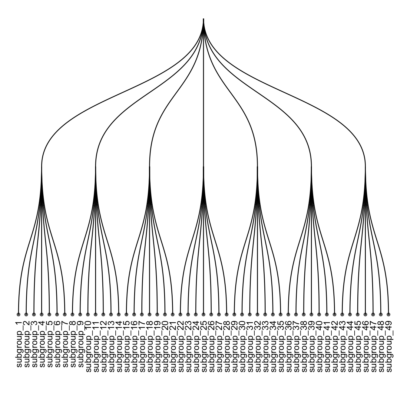
ggraph(mygraph, layout = 'dendrogram') +
geom_edge_diagonal() +
geom_node_text(aes( label=name, filter=leaf) , angle=90 , hjust=1, nudge_y = -0.04) +
geom_node_point(aes(filter=leaf) , alpha=0.6) +
ylim(-.5, NA)Customize aesthetics
It is a common task to add color or shapes to your dendrogram. It allows to show more clearly the organization of the dataset.
ggraph works the same way as ggplot2. In
the aesthetics part of each component, you can use a column of your
initial data frame to be mapped to a shape, a color, a size or
other..