About
This page showcases the work of Gilbert Fontana, which was originally published on twitter.
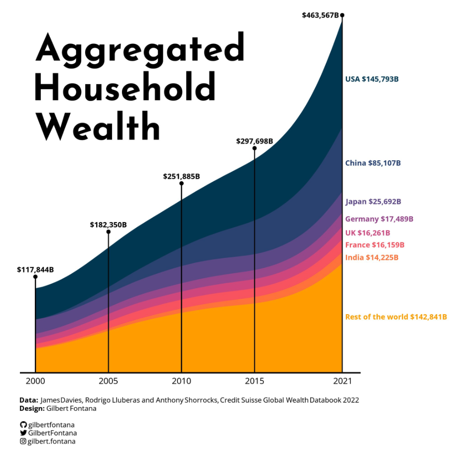
Thanks to him for accepting sharing his work here! As a teaser, here is the plot we’re gonna try building:
Required packaged
As usual, let’s start by loading some libraries.
Today’s plot requires quite a lot of packages to be built. You can
install them with the install.packages() function. Once
installed, load them with the library() function:
library(tidyverse)
#library(janitor)
library(readxl)
library(ggstream)
library(showtext)
library(ggtext)
You are probably familiar with the tidyverse already.
readxl will be used in the next section to load the
dataset from a xlsx format directly.
ggstream is used to smooth the area shapes.
showtext is used to load some
custom fonts.
Load and prepare the data
The data is stored on
github
in a xslx file. To reproduce this tutorial, please
download the file and run the following line of code. The
read_excel() function of the readxl package
makes it easy to load this file directly without requiring the
.csv format.
Note: do not forget to update the path to point to the file on your computer.
Basic stacked area chart
Everything start with a basic stacked area chart. You can see many examples in the stacked area chart section of the R graph gallery, including beginner level tutorials.
Basically, the ggplot function is used to start a chart
with ggplot2. Then, the year column of the
dataset (df) is used for the x axis,
total_wealth for the Y axis and everything is stacked and
colored using the country column.
Last but not least, the geom_area geom can be used to
create a stacked area chart.
# Stacked area chart with smoothing
df %>%
  ggplot(aes(year, total_wealth, fill = country, label = country, color = country)) +
  geom_area()
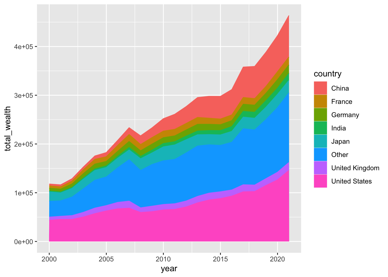
That’s it! 🔥 We now have a first stacked area chart showing what’s happening in our dataset.
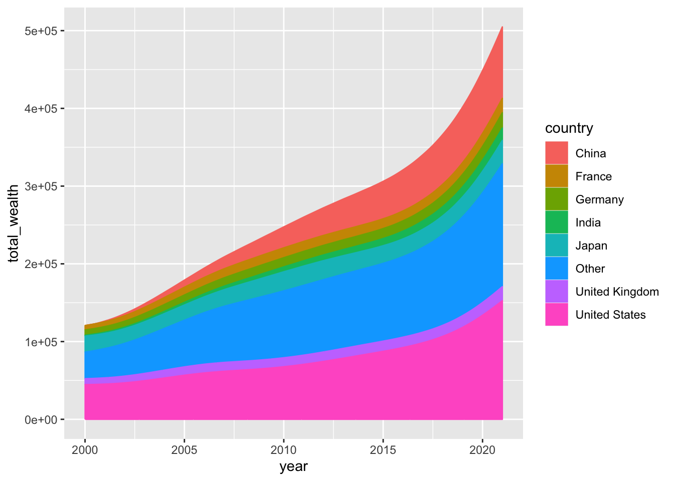
Smoothing the lines
It is possible to make the lines smoother thanks to the
geom_stream geom of the ggstream package.
It’s gonna create a less accurate but more organic and eye catching
shape to the graph:
# Stacked area chart with smoothing
df %>%
  ggplot(aes(year, total_wealth, fill = country, label = country, color = country)) +
  geom_stream(type = "ridge", bw=1)
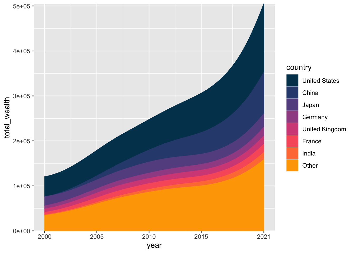
Color scale and stacking order
What looks especially good in Gilbert’s chart is the color palette.
Let’s build a vector of color that we then inject into the chart using
the scale_fill_manual and
scale_color_manual functions:
#Color palette
pal=c("#003f5c",
      "#2f4b7c",
      "#665191",
      "#a05195",
      "#d45087",
      "#f95d6a",
      "#ff7c43",
      "#ffa600")

# Stacking order
order <- c("United States", "China", "Japan", "Germany", "United Kingdom", "France", "India", "Other")

# Use them for the plot
df %>%
  arrange(total_wealth) %>%
  mutate(country = factor(country, levels=order)) %>%
  ggplot(aes(year, total_wealth, fill = country, label = country, color = country)) +
  geom_stream(type = "ridge" ,bw=1) +

  scale_fill_manual(values=pal) +
  scale_color_manual(values=pal) +
  scale_x_continuous(breaks=c(2000,2005,2010,2015,2021),labels = c("2000","2005","2010","2015","2021")) +
  scale_y_continuous(expand = c(0,0)) +
  coord_cartesian(clip = "off")
Using custom fonts
Before adding the title, legend and inline labels we need to load some custom fonts.
This is made possible thanks to the
showtext package and its
font_add_google() function. Using custom fonts can be a
bit tricky. Fortunately, I wrote a
complete tutorial
just in case the following code sounds strange to you.
# Name of the fonts we need
font <- "Josefin Sans"
font2 <- "Open Sans"

# Use the font_add_google() function to load fonts from the web
font_add_google(family=font, font, db_cache = FALSE)
font_add_google(family=font2, font2, db_cache = FALSE)

fa_path <- systemfonts::font_info(family = "Font Awesome 6 Brands")[["path"]]
font_add(family = "fa-brands", regular = fa_path)

theme_set(theme_minimal(base_family = font2, base_size = 3))

bg <- "white"
txt_col <- "black"

showtext_auto(enable = TRUE)
Since we are talking about thext, let’s also create the caption text that appear at the bottom of the figure:
caption_text <- str_glue("**Data:** James Davies, Rodrigo Lluberas and Anthony Shorrocks, Credit Suisse Global Wealth Databook 2022<br>",
"**Design:** Gilbert Fontana <br><br>",
"<span style='font-family: \"fa-brands\"'></span> gilbertfontana<br>",
"<span style='font-family: \"fa-brands\"'></span> GilbertFontana<br>",
"<span style='font-family: \"fa-brands\"'></span> gilbert.fontana"
)Color, legends, titles and labels
The final figure can now be created:
- the basic stacked area chart with great color is made as described above
-
the title is used thanks to the
annotate()function -
all inline labels are built 1 by 1, thanks to the
annotate()function again -
vertical segments are made made one by one using the
geom_segment()function
plot <- df %>%
  arrange(total_wealth) %>%
  mutate(country = factor(country, levels=order)) %>%
  ggplot(aes(year, total_wealth, fill = country, label = country, color = country)) +
  geom_stream(type = "ridge" ,bw=1) +

  #Title
  annotate("text", x = 2000, y = 410000,
           label = "Aggregated\nHousehold\nWealth",
           hjust=0,
           size=15,
           lineheight=.9,
           fontface="bold", family=font,
           color="black") +

  #USA
  annotate("text", x = 2021.2, y = 420000,
           label = "USA $145,793B",
           hjust=0,
           size=3,
           lineheight=.8,
           fontface="bold", family=font2,
           color=pal[1]) +
  #China
  annotate("text", x = 2021.2, y = 300000,
           label = "China $85,107B",
           hjust=0,
           size=3,
           lineheight=.8,
           fontface="bold",family=font2,
           color=pal[2]) +
  #Japan
  annotate("text", x = 2021.2, y = 245000,
           label = "Japan $25,692B",
           hjust=0,
           size=3,
           lineheight=.8,
           fontface="bold",family=font2,
           color=pal[3]) +
  #Germany
  annotate("text", x = 2021.2, y = 220000,
           label = "Germany $17,489B",
           hjust=0,
           size=3,
           lineheight=.8,
           fontface="bold",family=font2,
           color=pal[4]) +
  #UK
  annotate("text", x = 2021.2, y = 200000,
           label = "UK $16,261B",
           hjust=0,
           size=3,
           lineheight=.8,
           fontface="bold",family=font2,
           color=pal[5]) +
  #France
  annotate("text", x = 2021.2, y = 183000,
           label = "France $16,159B",
           hjust=0,
           size=3,
           lineheight=.8,
           fontface="bold",family=font2,
           color=pal[6]) +
  #India
  annotate("text", x = 2021.2, y = 165000,
           label = "India $14,225B",
           hjust=0,
           size=3,
           lineheight=.8,
           fontface="bold",family=font2,
           color=pal[7]) +
  #Other
  annotate("text", x = 2021.2, y = 80000,
           label = "Rest of the world $142,841B",
           hjust=0,
           size=3,
           lineheight=.8,
           fontface="bold",family=font2,
           color=pal[8]) +

  ## Vertical segments
  geom_segment(aes(x = 2000, y = 0, xend = 2000, yend = 117426+20000),color="black") +
  geom_point(aes(x = 2000, y = 117426+20000),color="black") +
  annotate("text", x = 2000, y = 117426+30000,
           label = "$117,844B",
           hjust=0.5,
           size=3,
           lineheight=.8,
           fontface="bold",family=font2,
           color=txt_col) +

  geom_segment(aes(x = 2005, y = 0, xend = 2005, yend = 181731+20000),color="black") +
  geom_point(aes(x = 2005, y = 181731+20000),color="black") +
  annotate("text", x = 2005, y = 181731+30000,
           label = "$182,350B",
           hjust=0.5,
           size=3,
           lineheight=.8,
           fontface="bold",family=font2,
           color=txt_col) +

  geom_segment(aes(x = 2010, y = 0, xend = 2010, yend = 250932+20000),color="black") +
  geom_point(aes(x = 2010, y = 250932+20000),color="black") +
  annotate("text", x = 2010, y = 250932+30000,
           label = "$251,885B",
           hjust=0.5,
           size=3,
           lineheight=.8,
           fontface="bold",family=font2,
           color=txt_col) +

  geom_segment(aes(x = 2015, y = 0, xend = 2015, yend = 296203+25000),color="black") +
  geom_point(aes(x = 2015, y = 296203+25000),color="black") +
  annotate("text", x = 2015, y = 296203+35000,
           label = "$297,698B",
           hjust=0.5,
           size=3,
           lineheight=.8,
           fontface="bold",family=font2,
           color=txt_col) +

  geom_segment(aes(x = 2021, y = 0, xend = 2021, yend = 461370+50000),color="black") +
  geom_point(aes(x = 2021, y = 461370+50000),color="black") +
  annotate("text", x = 2021, y = 461370+50000,
           label = "$463,567B",
           hjust=1.1,
           size=3,
           lineheight=.8,
           fontface="bold",family=font2,
           color=txt_col) +

  #Color scale
  scale_fill_manual(values=pal) +
  scale_color_manual(values=pal) +
  scale_x_continuous(breaks=c(2000,2005,2010,2015,2021),labels = c("2000","2005","2010","2015","2021")) +
  scale_y_continuous(expand = c(0,0)) +

  #Last customization
  coord_cartesian(clip = "off") +
  xlab("") +
  ylab("") +
  labs(caption = caption_text #"Data: Flash Eurobarometer, Number 509 (October 2022)"
  ) +
  theme(
    axis.line.x = element_line(linewidth = .75),
    panel.grid = element_blank(),
    axis.text.y=element_blank(),
    axis.text.x = element_text(color=txt_col, size=10,margin = margin(5,0,0,0)),
    plot.margin = margin(20,120,20,20),
    legend.position = "none",
    plot.caption = element_markdown(hjust=0, margin=margin(10,0,0,0), size=8, color=txt_col, lineheight = 1.2),
  )