This section is tightly linked with other sections. A line chart is the same but doesn't fill the surface between the line and the X axis. A connected scatterplot is almost the same thing, but each observation is represented as a dot. More generally, the time series section can interest you.
connected scatter line chart time seriesggplot2ggplot2 allows to draw line charts thanks to the geom_line() function. It expects as input a data frame with 2 numeric variables, one displayed on each axis. Start your journey with the most basic line chart.
dygraphThe dygraph package is dedicated to time series visualization. It offers zooming, hovering, minimaps and much more. Visit the time series section that is dedicated to it for more.
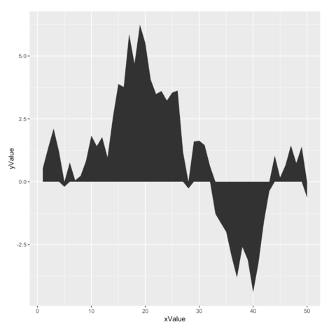
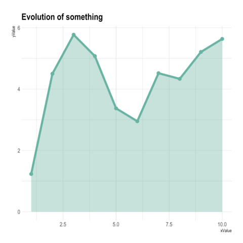
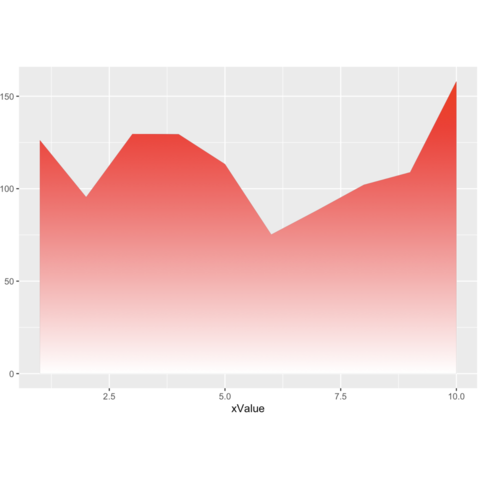
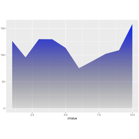
In base R, the combination of the plot() and the polygon() functions allows to build quality area charts.
The web is full of astonishing R charts made by awesome bloggers. The R graph gallery tries to display some of the best creations and explain how their source code works. If you want to display your work here, please drop me a word or even better, submit a Pull Request!