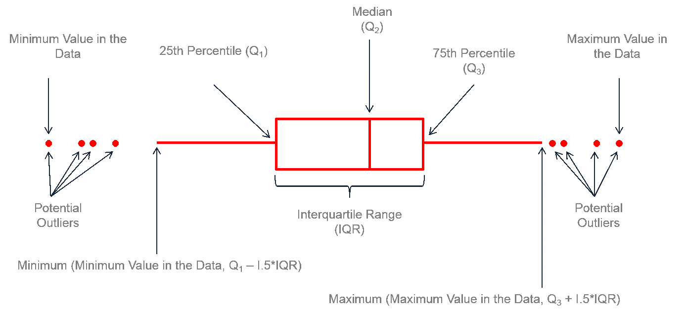
Anatomy of a boxplot - Explanation - Image source
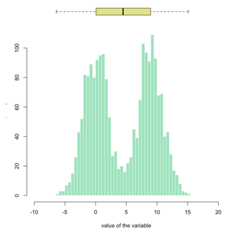
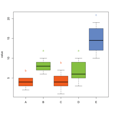
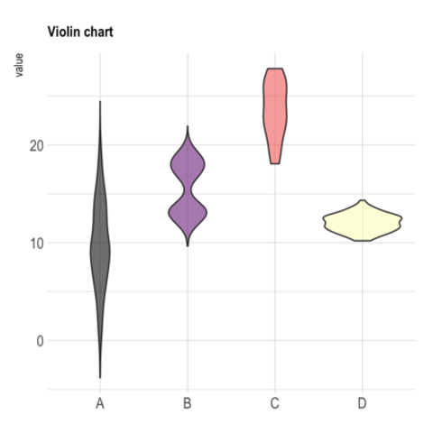
Boxplot is probably the most commonly used chart type to compare distribution of several groups. However, you should keep in mind that data distribution is hidden behind each box. For instance, a normal distribution could look exactly the same as a bimodal distribution. Please read more explanation on this matter, and consider a violin plot or a ridgline chart instead.
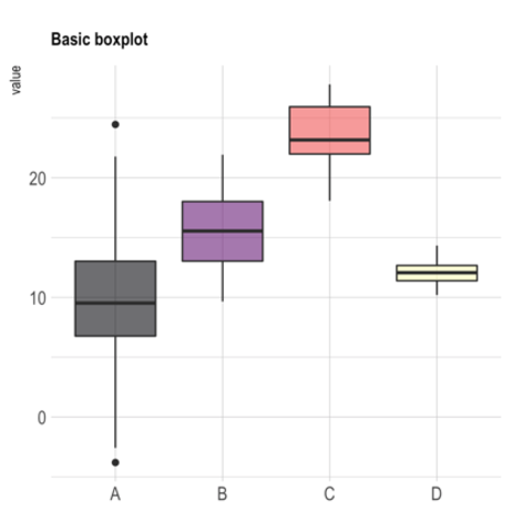
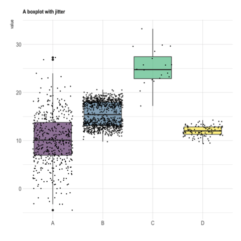
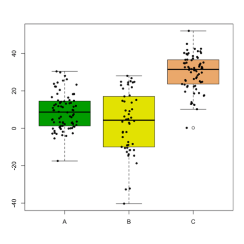
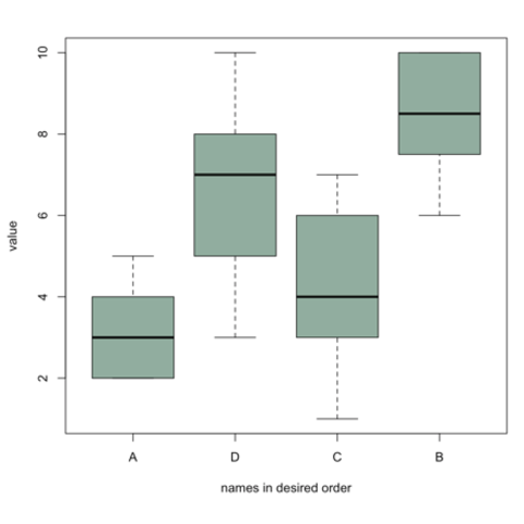
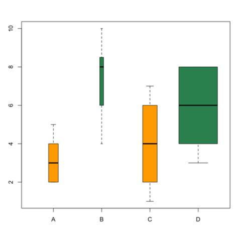
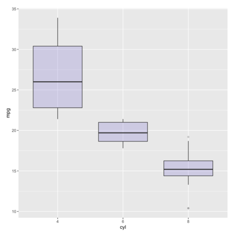
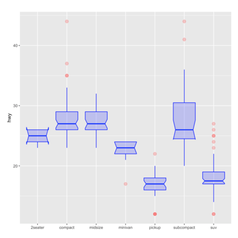
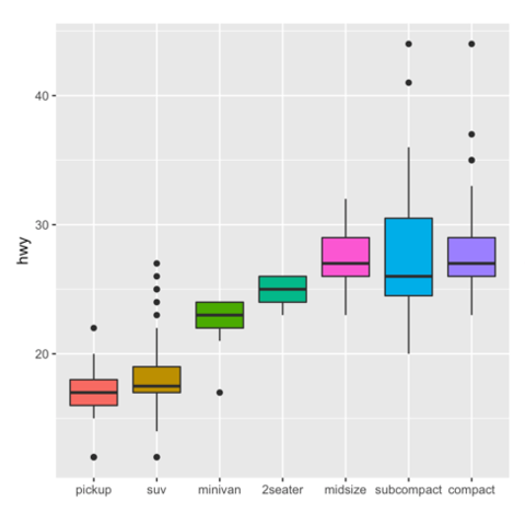
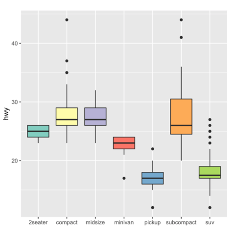
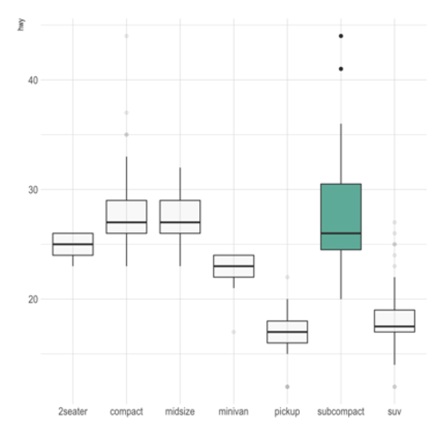
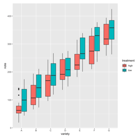
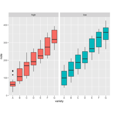
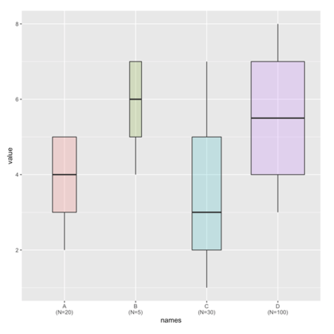
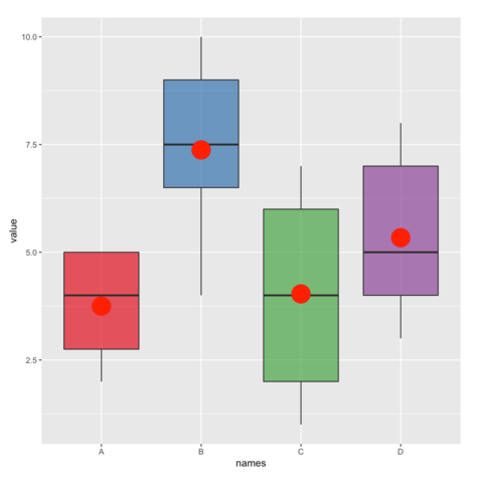
Boxplot are built thanks to the geom_boxplot() geom of ggplot2. See its basic usage on the first example below. Note that reordering groups is an important step to get a more insightful figure. Also, showing individual data points with jittering is a good way to avoid hiding the underlying distribution.
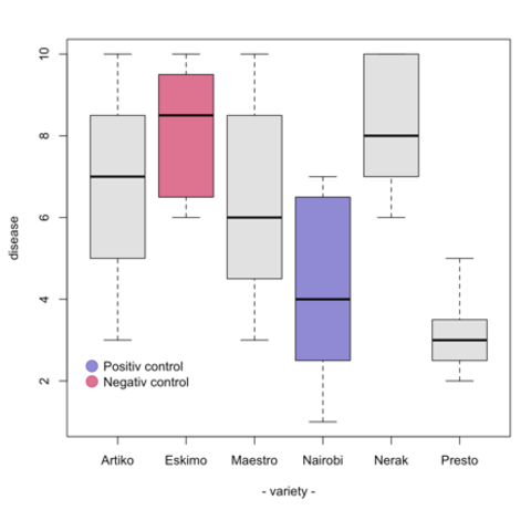
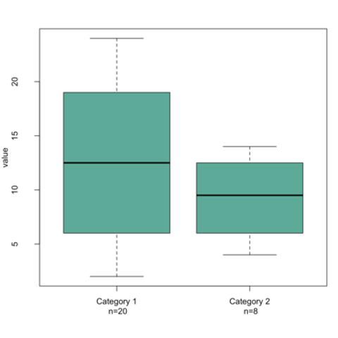
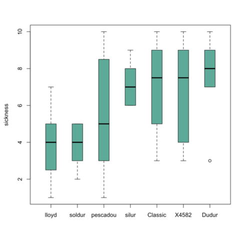
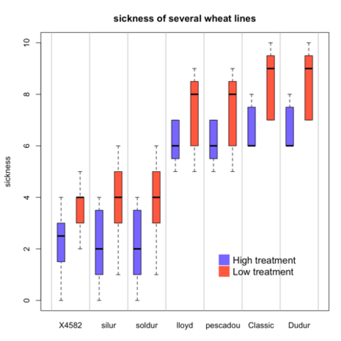
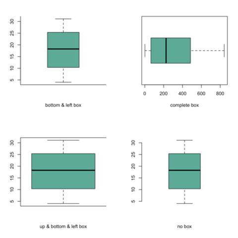
Build boxplot with base R is totally doable thanks to the boxplot() function. Here are a few examples of its use: