About
This chart uses a vertical line chart to show the party advantage in the U.S. House of Representatives from 1976 to the present. The chart is inspired by a graphic from FiveThirtyEight and has been created by Aman Bhargava.
Thanks to him for sharing its work!
Libraries
First we start by loading the necessary libraries.
Note: Install urbnmapr with
devtools::install_github("UrbanInstitute/urbnmapr")
since it’s not on CRAN.
Dataset
The main dataset is retrieved from the TidyTuesday GitHub repository.
path <- "https://raw.githubusercontent.com/rfordatascience/tidytuesday/master/data/2023/2023-11-07/house.csv"
data <- read.csv(path)

path <- "https://github.com/holtzy/R-graph-gallery/blob/master/DATA/democrats-and-republicans.csv?raw=true"
path <- "DATA/democrats-and-republicans.csv"
advantage_df <- read.csv(path)

path <- "https://github.com/holtzy/R-graph-gallery/blob/master/DATA/US-presidents.csv?raw=true"
path <- "DATA/US-presidents.csv"
presidents_df <- read.csv(path)
Creating the right chart
- Use
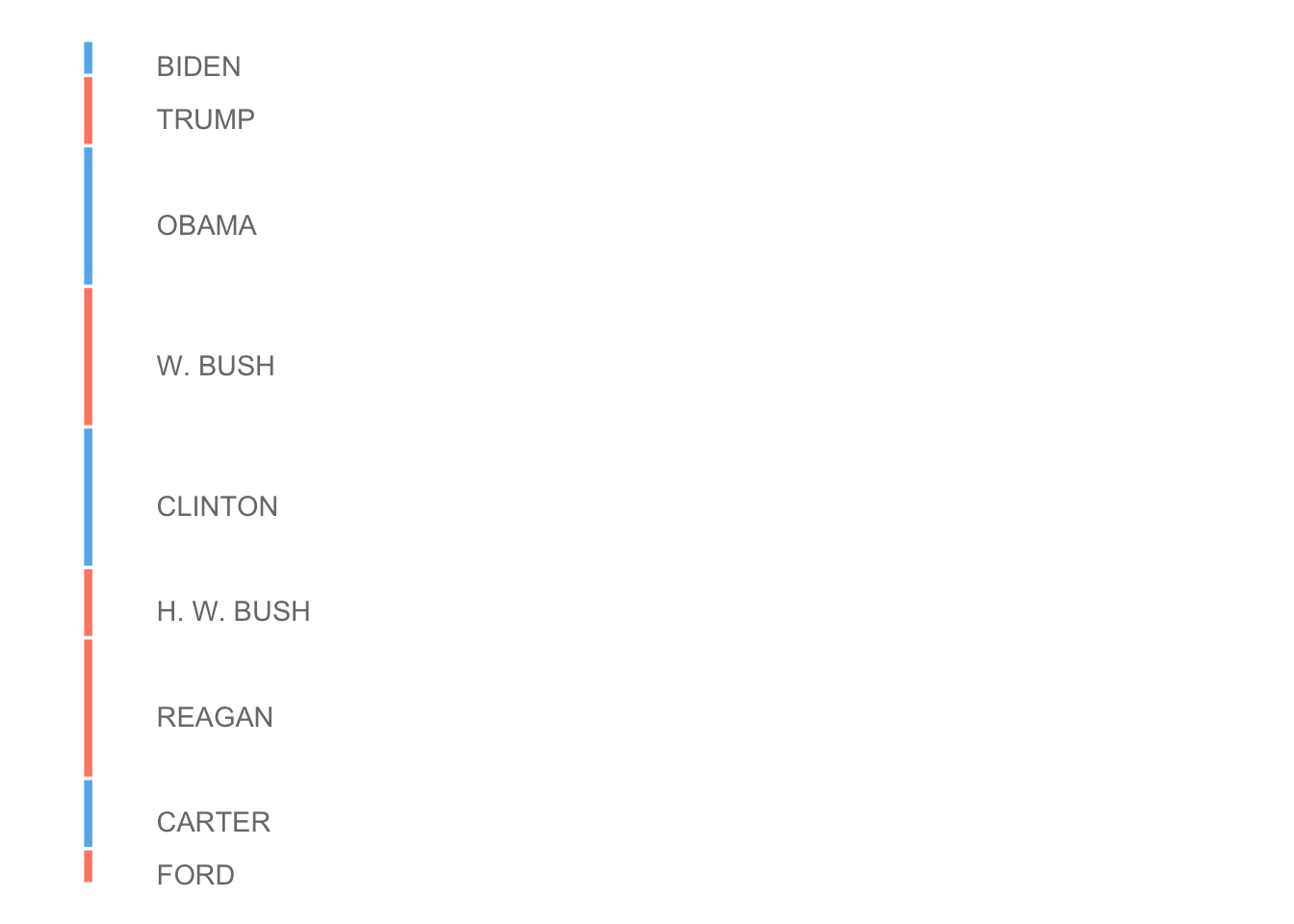
ggplot()to create the base plot - Add segments representing each president’s term, colored by party
- Add text labels for each president’s name
- Customize the theme to remove unnecessary elements
- Set up the y-axis scale to align with the main chart
- Use
coord_flip()to make the chart vertical
right_chart <- ggplot() +
   geom_segment(
      data = presidents_df,
      aes(
         x = Start_Year,
         y = 330,
         xend = End_Year,
         yend = 330,
         colour = prez_party
      ),
      linewidth = 1.5,
      show.legend = FALSE
   ) +
   geom_text(
      data = presidents_df,
      aes(
         x = (Start_Year + End_Year) / 2 + 0.1,
         y = 400,
         label = president,
      ),
      color = "#7A7A7A",
      size = 3.8,
      hjust = 0, # Center the text horizontally
      vjust = 1, # Adjust vertical position of text,
      show.legend = FALSE
   ) +
   scale_y_continuous(
      limits = c(300, 1500),
      position = "left"
   ) +
   scale_color_manual(values = c("#64B6EC", "#FF8972")) +
   theme_void() +
   theme(plot.margin = margin(t = 0, r = 0, b = 0, l = 0, "points")) +
   coord_flip()

right_chart
Creating the left chart
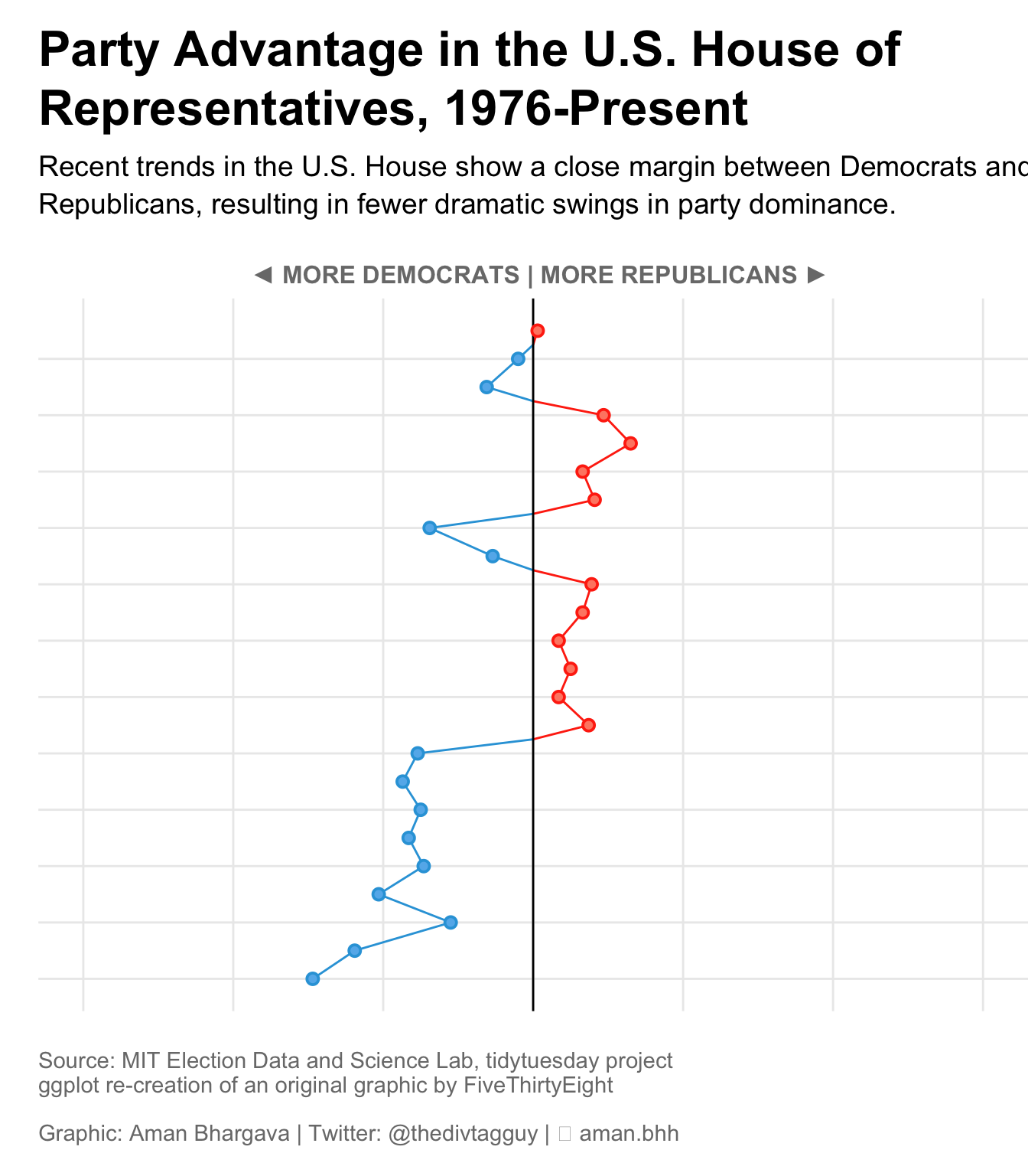
- Use ggplot to create the base plot with year on the y-axis and advantage on the x-axis
- Add a line geom to show the trend over time
-
Add a horizontal line at
y=0to separate Democrat and Republican advantage - Add points to highlight non-zero advantage values
- Customize the theme, colors, and labels to match the desired style
- Set up the scales for x and y axes, including custom breaks and labels
- Add title, subtitle, and caption to provide context for the chart
left_chart <- advantage_df %>%
   ggplot(aes(
      x = year,
      y = advantage,
      color = majority,
      fill = majority
   )) +
   geom_line(aes(group = 1), show.legend = FALSE) +
   geom_hline(yintercept = 0, aes(linewidth = 0.5, alpha = 0.8)) +
   geom_point(
      shape = 21,
      data = . %>% filter(advantage != 0),
      size = 2,
      stroke = 1,
      show.legend = FALSE
   ) +
   coord_flip() +
   theme_minimal() +
   theme(
      plot.margin = margin(15, 0, 15, 0),
      panel.grid.major.x = element_line(),
      panel.grid.minor.x = element_blank(),
      panel.grid.minor.y = element_blank(),
      panel.border = element_blank(),
      axis.title = element_text(
         colour = "#7A7A7A",
         size = 12,
         face = "bold",
      ),
      axis.ticks.x = element_blank(),
      axis.ticks.y.right = element_line(),
      axis.text = element_text(
         colour = "#7A7A7A",
         family = "DecimaMonoPro",
         size = 12,
         face = "bold"
      ),
      plot.title = element_text(
         size = 24,
         hjust = 0,
         lineheight = 1,
         face = "bold",
         margin = margin(b = 10)
      ),
      plot.subtitle = element_text(
         hjust = 0,
         lineheight = 1.1,
         size = 14,
         margin = margin(b = 20)
      ),
      plot.caption = element_text(
         hjust = 0,
         colour = "#7A7A7A",
         size = 11,
         margin = margin(t = 20)
      )
   ) +
   scale_color_manual(values = c("#FF330F", "#2FA3DC")) +
   scale_fill_manual(values = c("#FF8972", "#64B6EC")) +
   scale_y_continuous(
      breaks = c(-300, -200, -100, 0, 100, 200, 300),
      labels = function(x) {
         ifelse(x == -300, paste0(abs(x), " seats"), abs(x))
      },
      limits = c(-300, 300),
      position = "right"
   ) +
   scale_x_continuous(breaks = seq(1976, 2023, by = 4)) +
   labs(
      x = "",
      y = str_to_upper("  ◄ More Democrats | More Republicans ►"),
      title = str_wrap(
         "Party Advantage in the U.S. House of Representatives, 1976-Present",
         width = 50
      ),
      subtitle = str_wrap(
         "Recent trends in the U.S. House show a close margin between Democrats and Republicans, resulting in fewer dramatic swings in party dominance.",
         width = 75
      ),
      caption = "Source: MIT Election Data and Science Lab, tidytuesday project \nggplot re-creation of an original graphic by FiveThirtyEight\n\nGraphic: Aman Bhargava | Twitter: @thedivtagguy | 🔗 aman.bh"
   )

left_chart
Combine the charts with patchwork
- Use the patchwork library to combine the two charts
-
Adjust the relative widths of the charts using
plot_layout()
Going further
You might be interested in:
- Learning more about line charts
- Use a bump chart to highlight changes over time
- Use a waffle chart to highlight changes over time