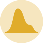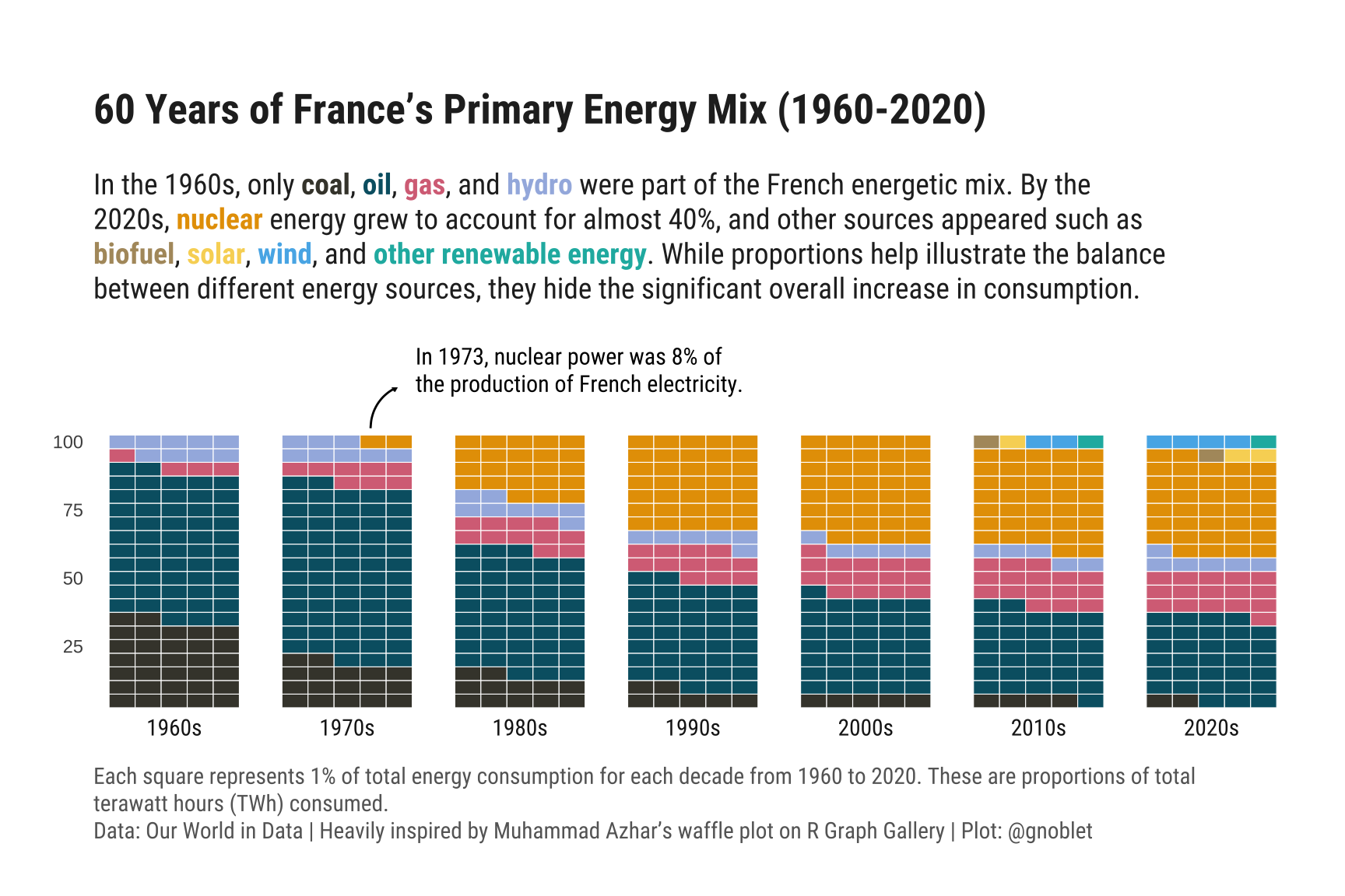
Waffle Chart for evolution of time
Using waffle charts to track the change of energy consumption in France since 1960.
by Guillaume Noblet
Read tutorial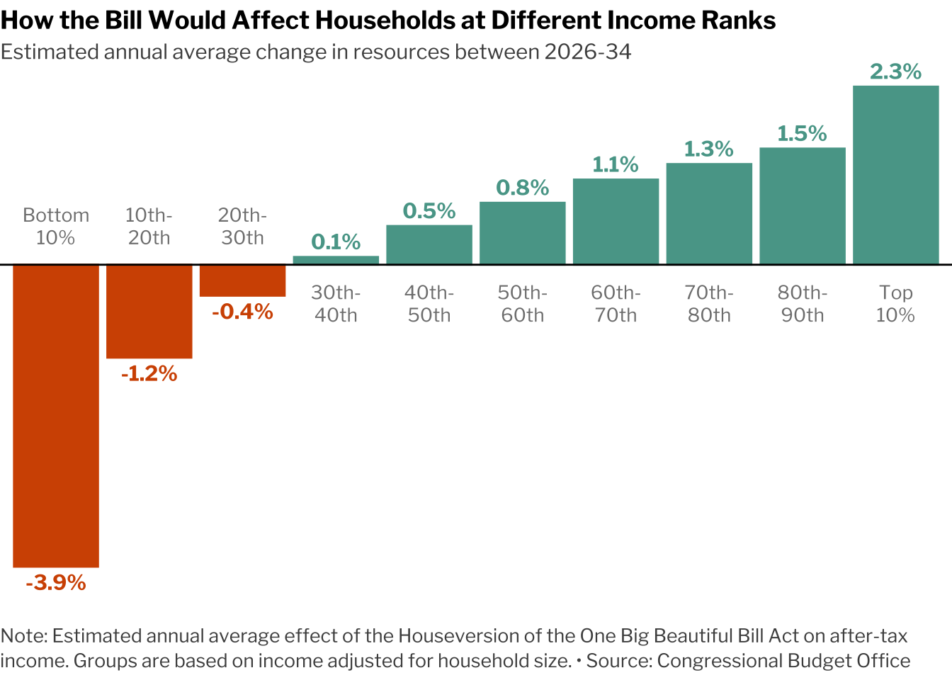
Diverging Barplot
A recreation of the NY Times diverging barplot showing houlsehold impact.
by Spencer Schien
Read tutorial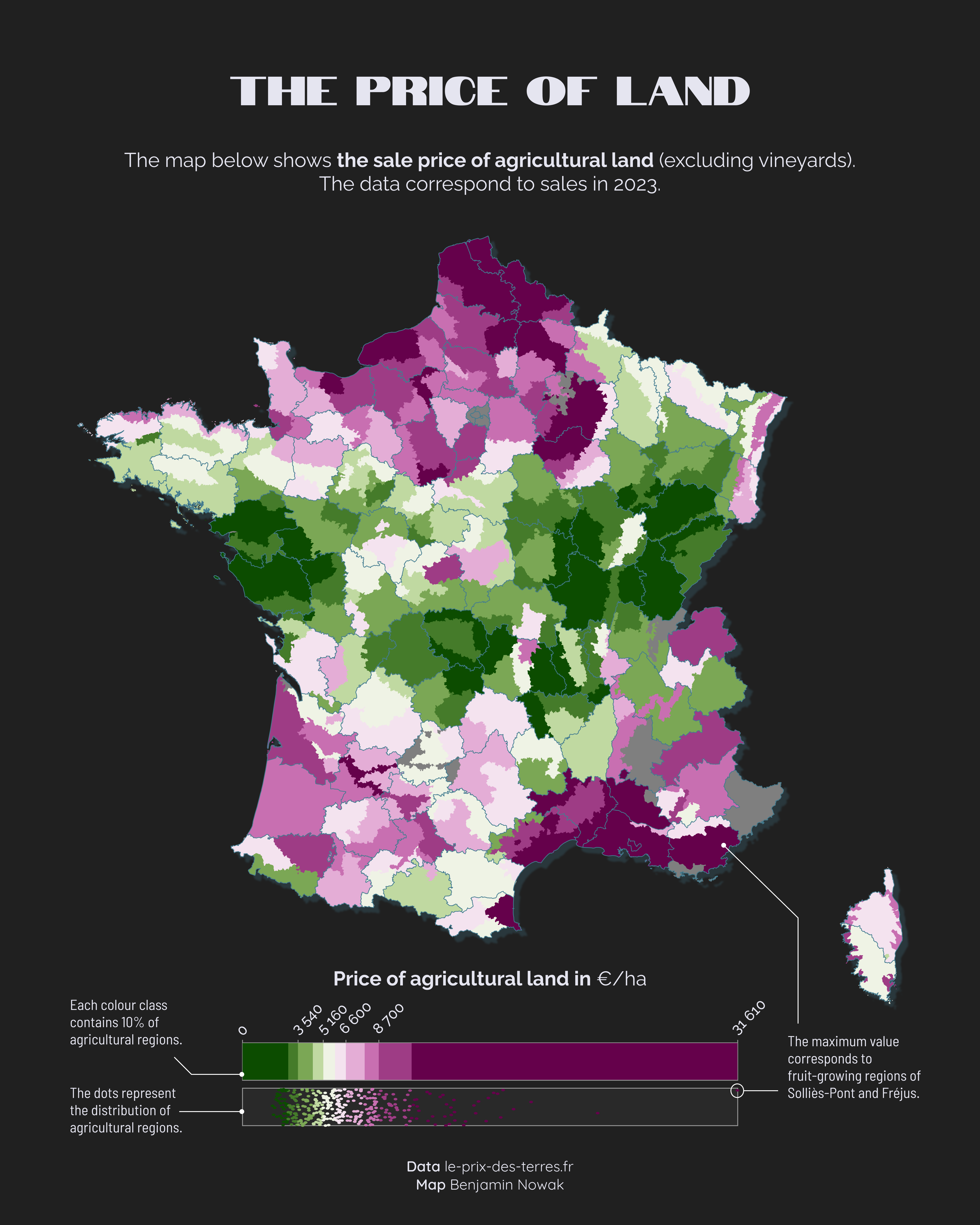
Choropleth Map with Quantiles
A choropleth map with a color scale based on quantiles and a highly customized legend that goes with it.
by Benjamin Nowak
Read tutorial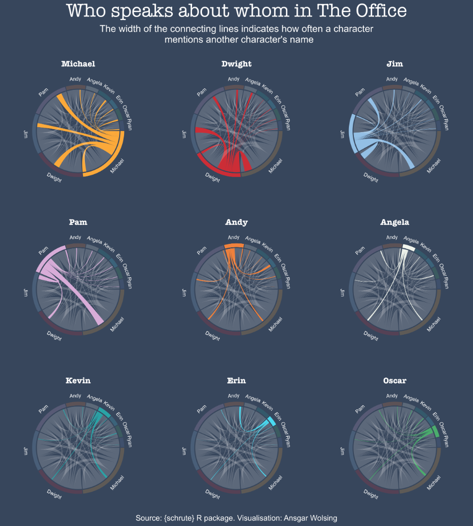
Chord diagram & small multiples
Chord diagrams effectively represent flows between entities, but too many connections can make them overwhelming. This example gains clarity and insight through small multiples!
by Ansgar Wolsing
Read tutorial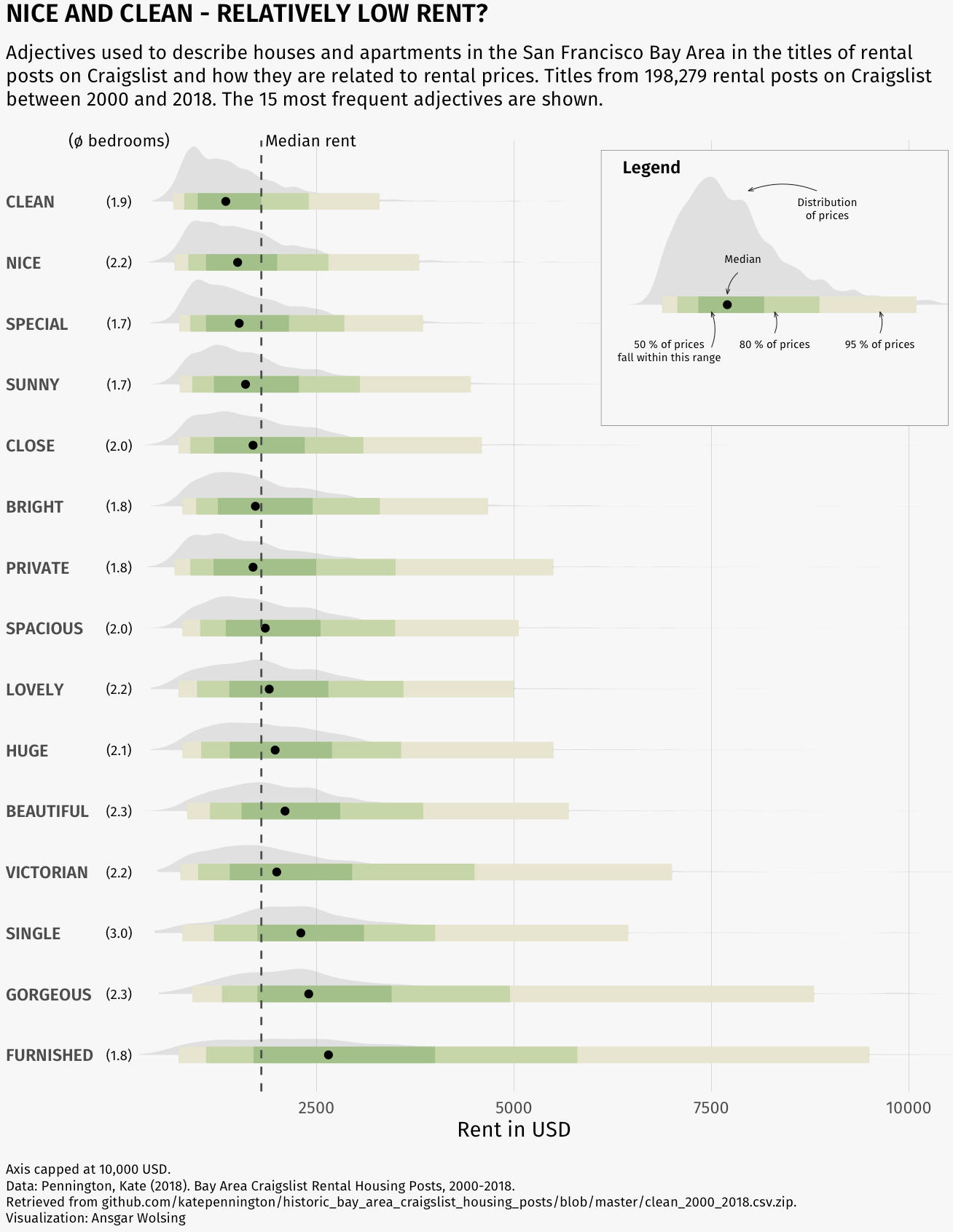
Ridgeline plot with inside plot
A good example of how to customize a ridgeline plot where the legend is actually a smaller plot inside the main one, explaining the data in a more detailed way.
by Ansgar Wolsing
Read tutorial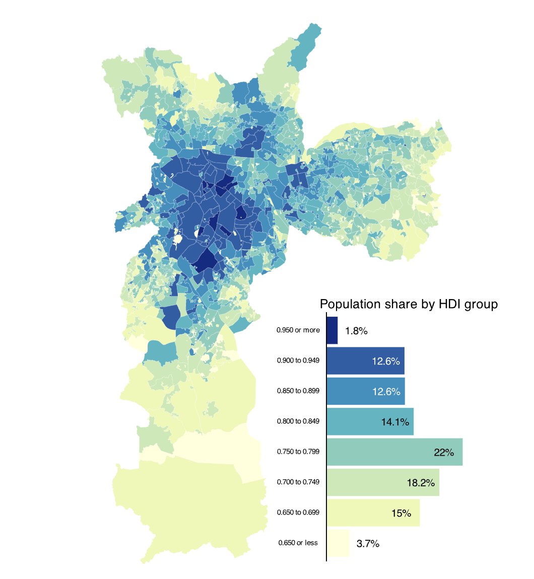
Choropleth map with barplot
A choropleth map with a barplot and annotations. A good example of how to combine different types of plots on a map.
by Vinicius Oike Reginatto
Read tutorial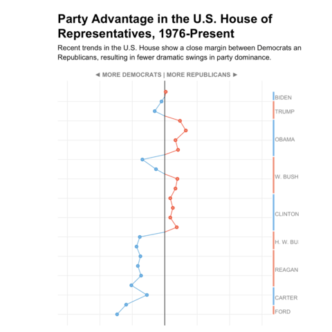
Vertical line chart
A vertical line chart with a nice color palette and a clean layout, made with ggplot2 and patchwork.
by Aman Bhargava
Read tutorial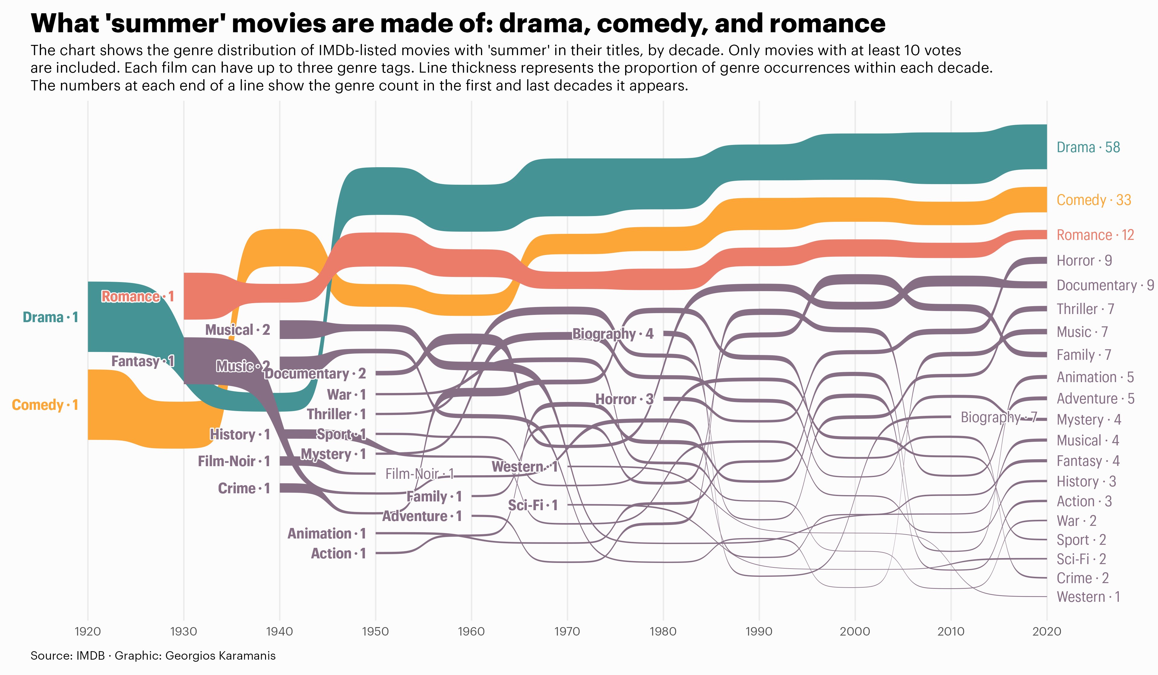
Sankey diagram
A sankey diagram with beautiful colors and annotations
by Georgios Karamanis
Read tutorial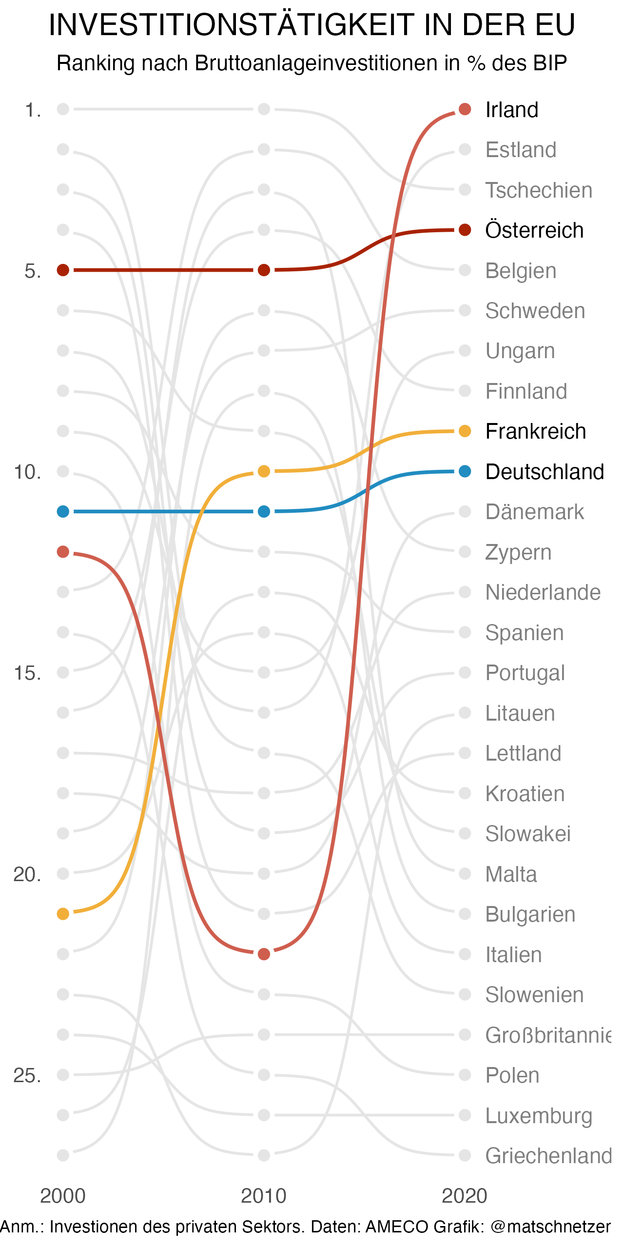
Bump chart with highlights
Find out how to use a bump chart for a time series and how to highlight specific lines with ggplot2.
by Matthias Schnetzer
Read tutorial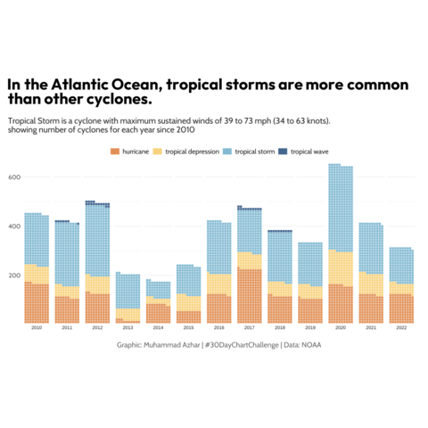
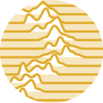
Waffle chart as a time series
Waffle charts can be used to display time series data. This chart shows the evolution of the number of storms since 2010.
by Muhammad Azhar
Read tutorial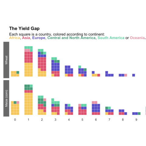
Waffle chart as a distribution
Waffle charts can be used to display and compare distributions between groups.
by Benjamin Nowak
Read tutorial
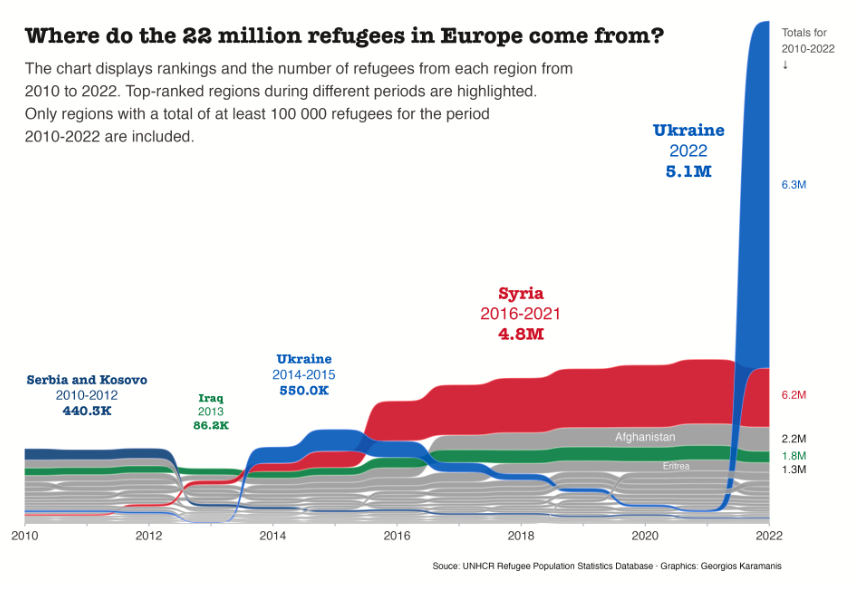
Bump Chart
A clean bump chart showing the evolution of migration flows to Europe.
by Georgios Karamanis
Read tutorial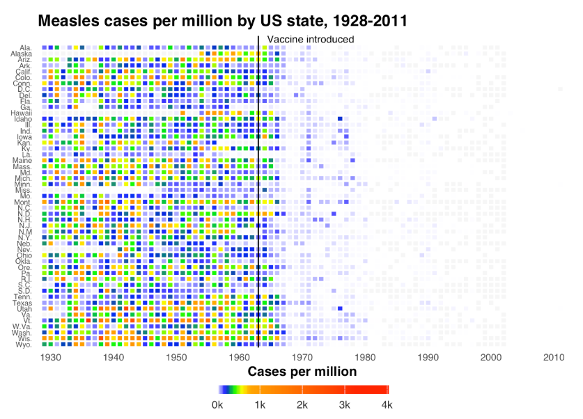
Vaccination Heatmap
Probably one of the most famous heatmaps ever, illustrating the impact of vaccination on measles cases. Heatmaps can be a powerful alternative for visualizing time series!
by Ben Moore
Read tutorial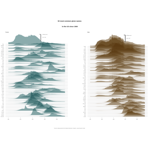
Double ridgeline plot
Combine two ridgeline plots to display several distributions
by Laura Navarro Soler
Read tutorial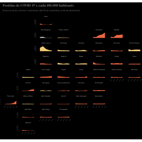
Small multiple area chart
Combine multiple area chart to display evolution of several categories
by Laura Navarro Soler
Read tutorial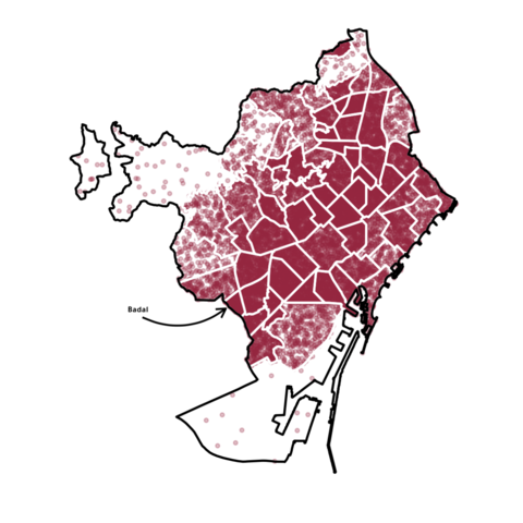
Density plot on a map
Measure population density with density plot
by Laura Navarro Soler
Read tutorial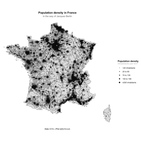
Bertin's valued points map
A map depicting the french population density in the style of Jacques Bertin. A good variation of the bubble map!
by Benjamin Nowak
Read tutorial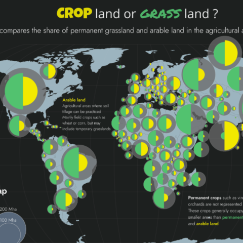
Customized Dorling Cartogram
Learn how to create a dorling cartogram: a variation of the bubble map where bubbles do not overlap to increase readability.
by Benjamin Nowak
Read tutorial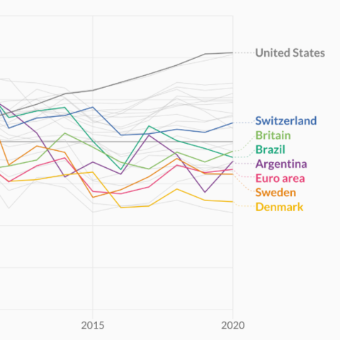
Line chart with labels
It is a common need to display labels at the end of the lines, since that's the place where labels are the more readable. Cédric Scherer gives us a nice walk-through here on how to do it with ggplot2.
by Cédric Scherer
Read tutorial
Line and Area charts by The Economist
Learn how to mimick the style of The Economist with libraries like ggplot2, patchwork, grid, ggtext and more.
by The Economist
Read tutorial
Line chart with filled intersection
This example uses geo-faceting: the dataset is split and plotted using geographical regions. For each charts, 2 lines are displayed and the intersection between both is filled.
by Georgios Karamanis
Read tutorial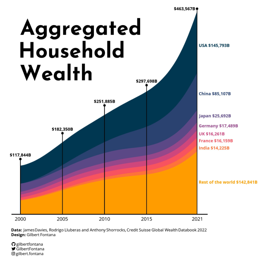
Stacked area chart with clean labels
A stacked area chart with a stunning color palette, some well positioned inline labels, some handy vertical annotations and some clean caption text.
by Gilbert Fontana
Read tutorial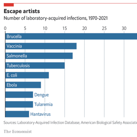
Barplot with The Economist's style
The example is a reproduction of a barplot published in The Economist. The barplot itself is simple, but all the customization going with it to mimick the style are worth a read.
by The Economist
Read tutorial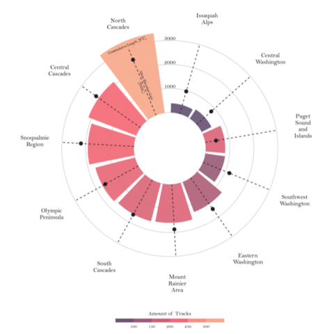
Circular barplot with several features per group
Compare the features of several hiking locations in Washington with a highly customized circular barplot.
by Tobias Stalder
Read tutorial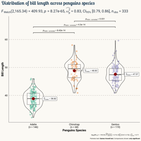
ggStatsPlot
Compare the distribution of 3 groups using a combination of
boxplot and violin plot with ggStatsPlot.
Probably
better than a barplot if you have several values per group!
by Tuo Wang
Read tutorial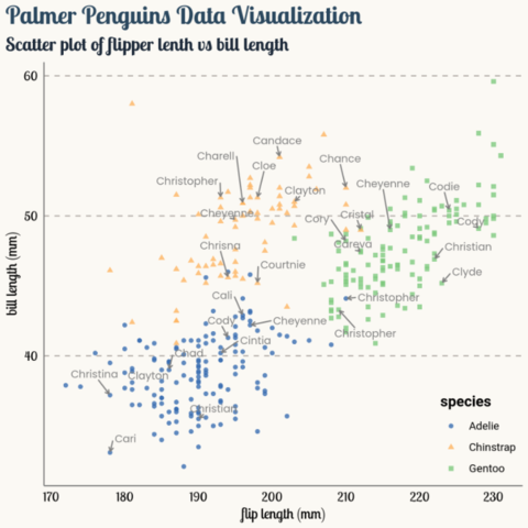
ggRepel
ggRepel allows to add multiple labels with no overlap automatically. Here is a good looking scatterplot using it!
by Tuo Wang
Read tutorial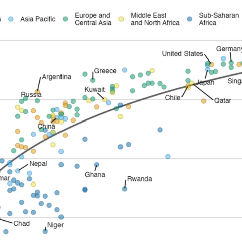
Scatterplot with regression fit and automatic text repel
A scatterplot with a regression fit to highlight the main trend, a clean color palette, a customized legend and some greatly selected labels with no overlap
by Claus O. Wilke
Read tutorial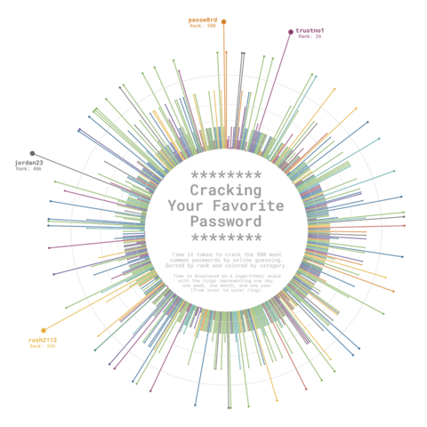
Circular lollipop chart
A circular lollipop chart with customized layout, in circle
legend and groups.
A work by
Cédric Scherer for the TidyTuesday challenge.
by Cédric Scherer
Read tutorial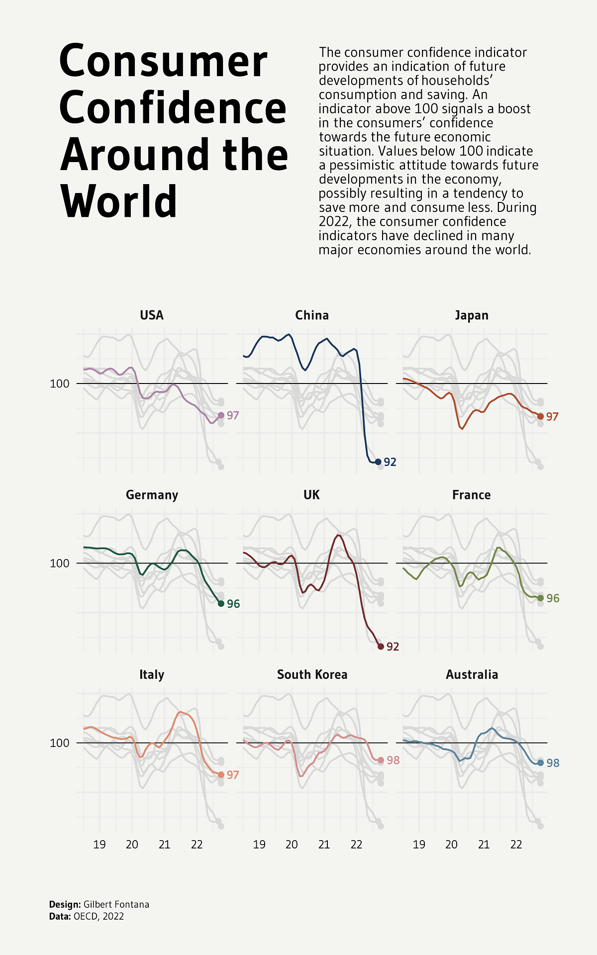
Line chart with small multiple
A line chart with small multiple where all groups are repeated (but greyed-out) on each pannel.
by Gilbert Fontana
Read tutorial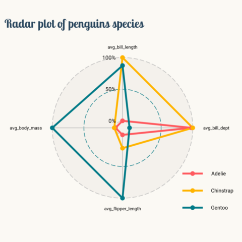
Radar chart with ggradar
A Spider chart made using the ggradar package and a
lot of customization.
by Tuo Wang
Read tutorial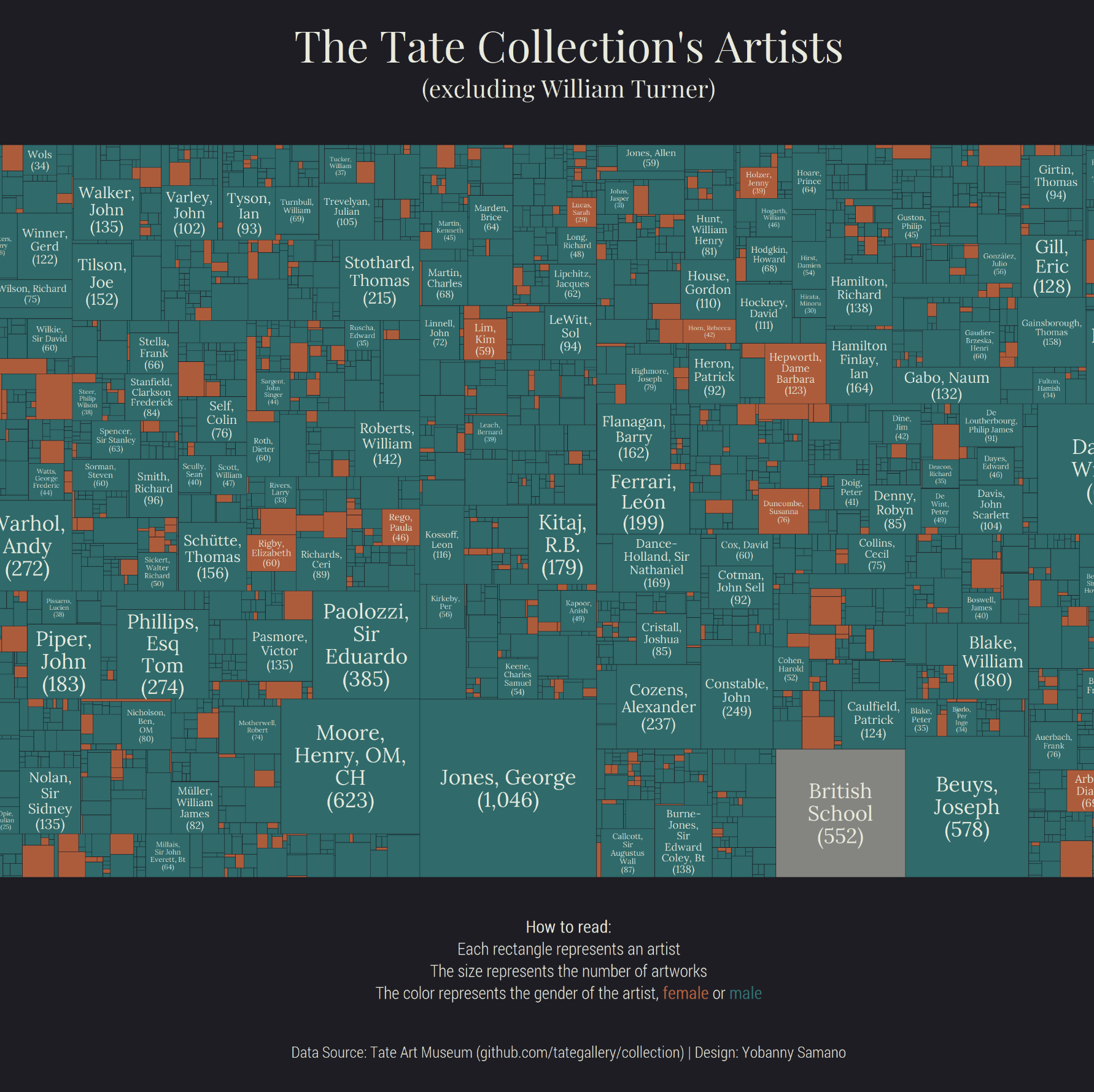
Treemap with annotations and labels
A treemap with annotations, labels and colors. A good example of how to customize a treemap with specific labels.
by Yobanny Sámano
Read tutorial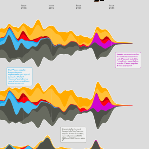
ggStream
ggStream is a ggplot2 extension allowing to make
stream graph with the tidyverse. Here is an example by Cédric
Scherer showcasing how to use this package.
by Cédric Scherer
Read tutorial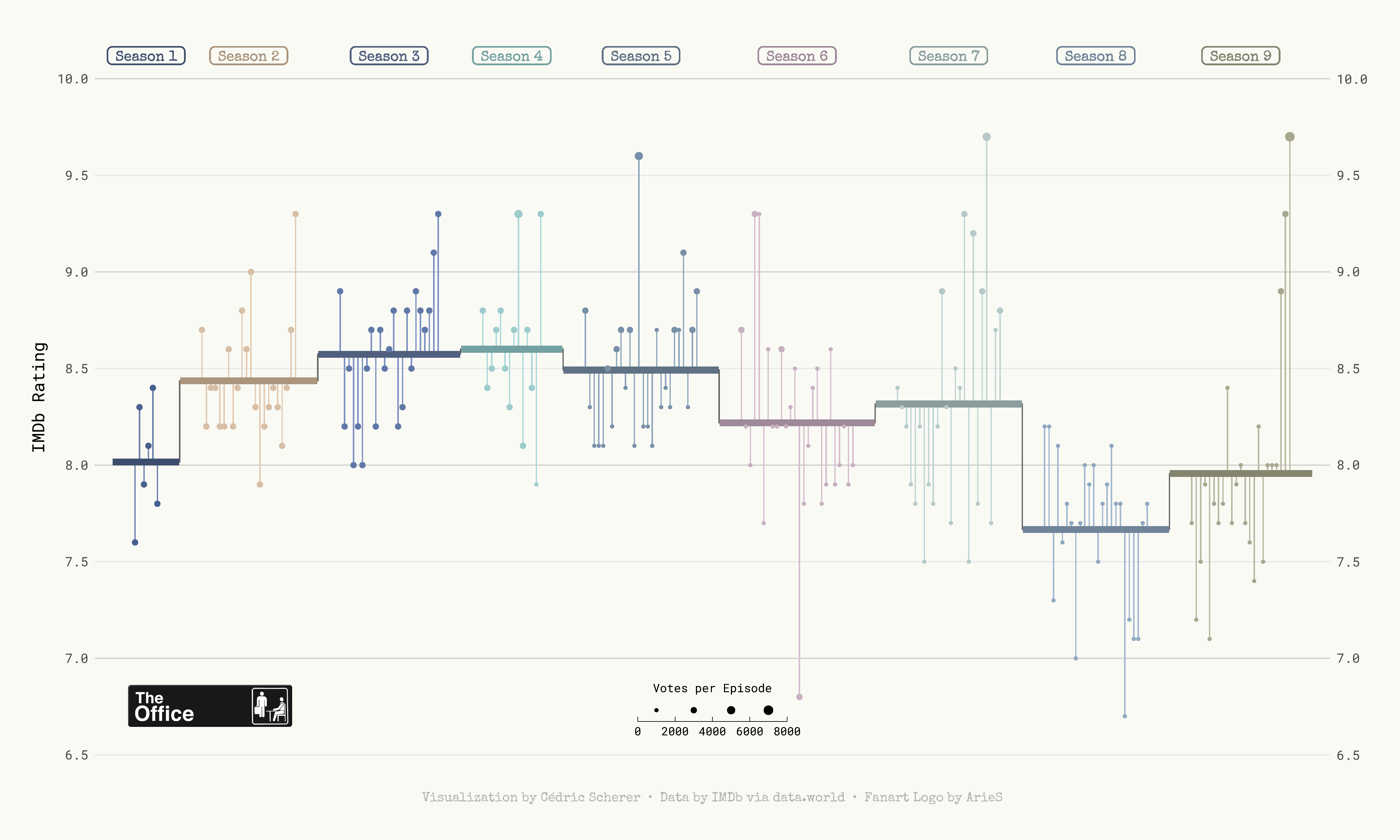
Lollipop chart for timeseries
A very highly customized lollipop chart representing Mario Kart
world records.
A work by Cédric Scherer for
the TidyTuesday challenge.
by Cédric Scherer
Read tutorial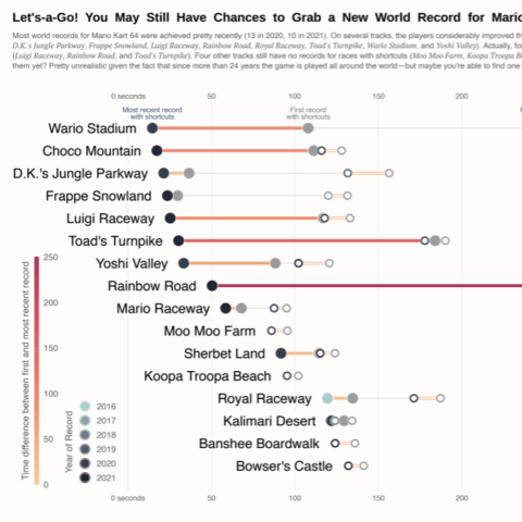
Double cleveland chart
A very highly customized lollipop chart representing Mario Kart
world records.
A work by Cédric Scherer for
the TidyTuesday challenge.
by Cédric Scherer
Read tutorial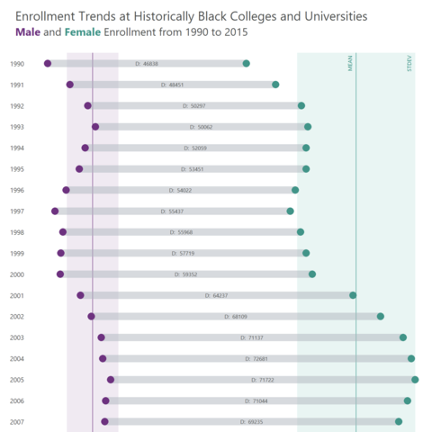
Extended dumbbell plot
An extended dumbbell plot with clean annotation for mean and
standard deviation.
A work by
Tobias Stalder for the TidyTuesday challenge.
by Tobias Stadler
Read tutorial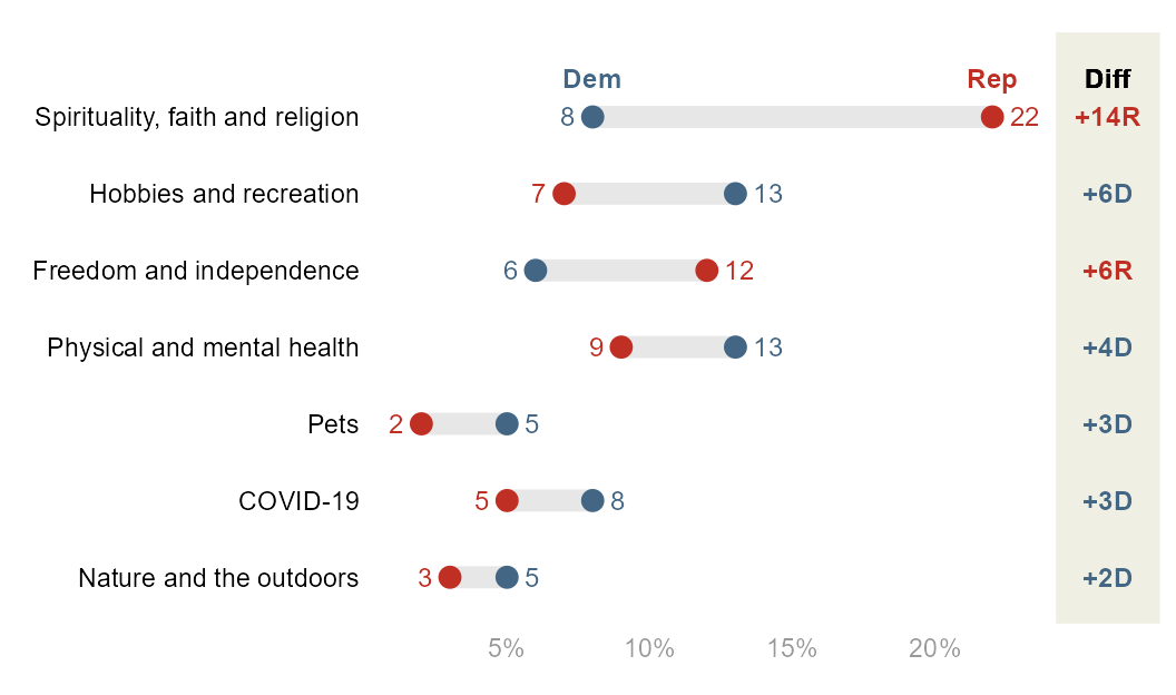
Dumbbell plot with gap section
An extended dumbbell plot originally published by the Pew research center. Clean design with a gap section on the right hand side.
by Fred Duong
Read tutorial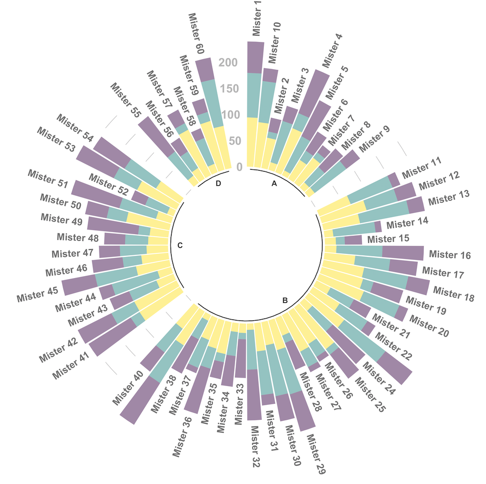
Stacked Circular Barplot
How to build a stacked circular barplot with multiple sub-groups with R and ggplot2
by Yan Holtz
Read tutorial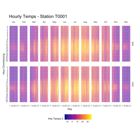
Heatmap for timeseries
How to use a clean heatmap to show timeseries data, revealing insightful patterns.
by John MacKintosh
Read tutorial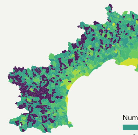
Choropleth map
A clean choropleth map showing the density or restauration per region in the south of France
by Yan Holtz
Read tutorial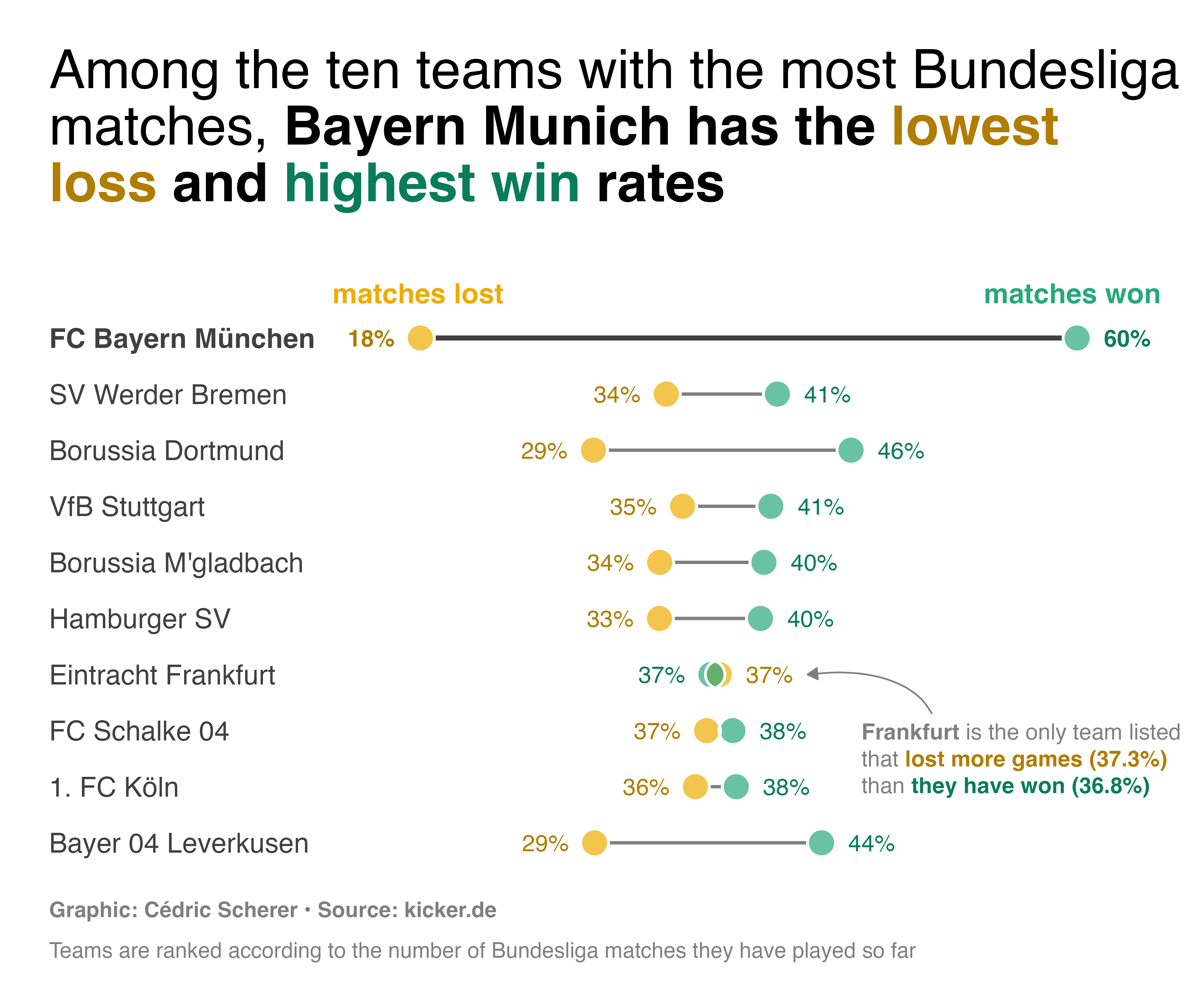
Dumbell chart
A dumbell chart is a variation of the barplot. It is used to compare the value of 2 variables for several groups.
by Cédric Scherer
Read tutorial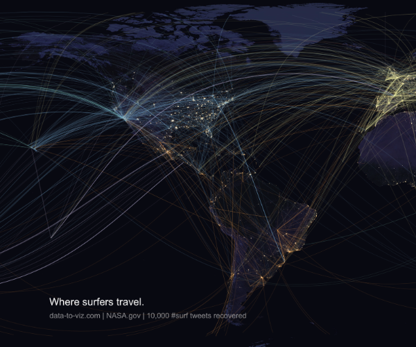
Connection map
Checking where surfers travel using twitter harvested Data.
by Yan Holtz
Read tutorialRelated chart types