

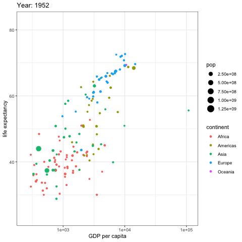


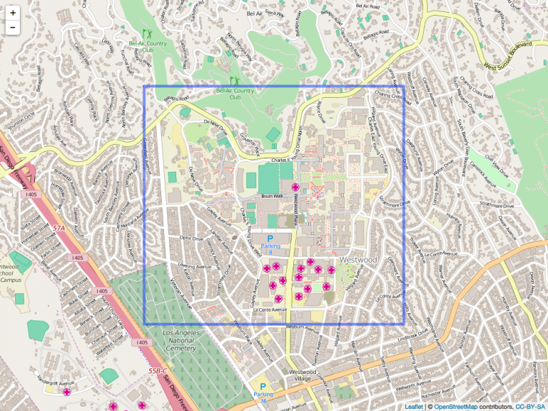


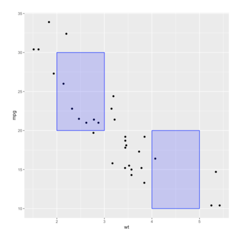
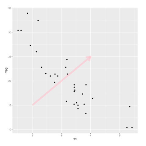
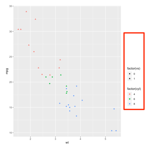
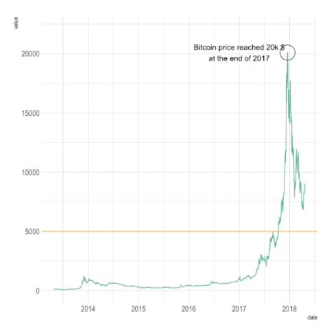
Rectangle
Learn how to use the annotate function to add a rectangle on a specific part of the chart.


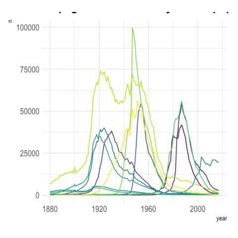


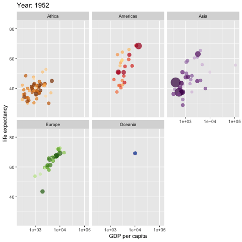
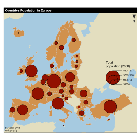
Simplify
Simplifying a geospatial object allows to get a lighter object that will be plotted faster.

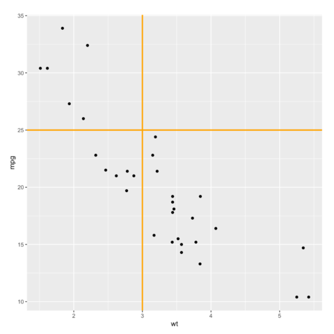
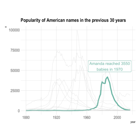
Rectangle
Learn how to use the annotate function to add a rectangle on a specific part of the chart.
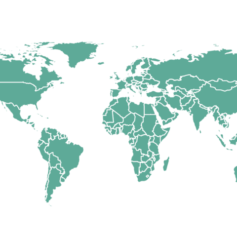
Simplify
Simplifying a geospatial object allows to get a lighter object that will be plotted faster.